Wearables


Quick Thoughts on Apple Watch

Quick Thoughts on Apple Watch

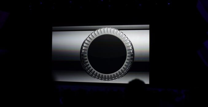
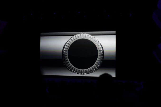
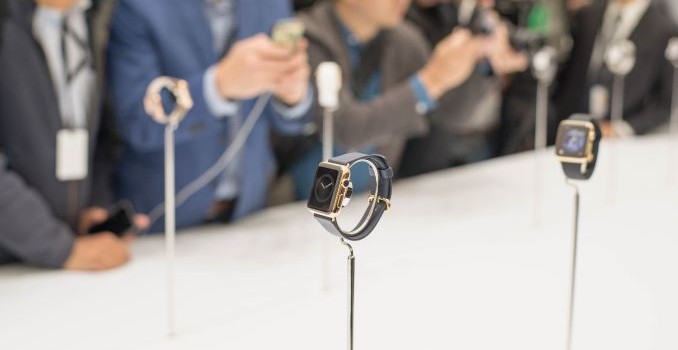
While I’m still unsure on what wearables should actually do, I managed to get some photos of the Apple Watch. Unfortunately I wasn’t really able to find any units available for a hands-on, and as far as I can tell it wasn’t possible to actually try any of the software yet. However, based upon what I’ve seen Apple brings at least a few great ideas to the table. The digital dial/crown is definitely one of them, as it opens up the door to all kinds of new possibilities for navigation that are currently either impractical or impossible for wearables that don’t have this hardware feature. In addition, Apple’s strong emphasis on personalization with two sizes, three editions, and six watch bands is something that all OEMs should pay attention to. Finally, the dedicated SoC for the Apple Watch is something that is absolutely necessary to enable a good user experience as space is so critical on these wearables. There’s also no question that Apple has done a great job of focusing on industrial and material design, as it looks like all three versions of the watch have premium materials and excellent fit and finish. While it isn’t clear what display is used, it seems likely that it’s an OLED display judging by the amount of black in some of the watchfaces, although ambient lighting in the demo area made it hard to tell whether this was the case.

However, my reservations are largely similar to concerns that I have with all wearables. Ultimately, the Apple Watch must provide utility that’s strong enough to make me turn around and get it if I forget it. As-is, I don’t really think that even the Apple Watch has that level of utility, even if it is excellently executed. Of course, this is also based upon a demo unit that I wasn’t able to touch or use.

Of course, a few concerns remain, mostly in the area of battery life as it seems that only the Pebble line of wearables can really deliver enough battery life to not worry about charging a wearable on any sort of regular schedule. At any rate, I’ve attached a gallery of photos below for those interested in seeing all the various combinations of watches that Apple will make.

Gallery: Apple Watch

Apple Announces the Apple Watch; Available Next Year

Apple Announces the Apple Watch; Available Next Year

Apple has thrown their hat into the wearable ring with the Apple watch, which tries to bring a better user experience to the watch without trying to adapt iOS to the watch with multi-touch gestures that we’re familiar with on the iPhone.

There’s a single crystal sapphire display, a digital dial crown that acts as a home button and a scroll system. There’s also a strong emphasis on haptic feedback which allows for linking of watches to share notifications by sending taps in any possible pattern. This is done by using a force sensitive touchscreen, which is a method of navigating along with the scrolling dial. This allows for subtle communication that doesn’t rely on obvious sound or gestures. It’s also possible to send taps based upon pulse/heart beat.

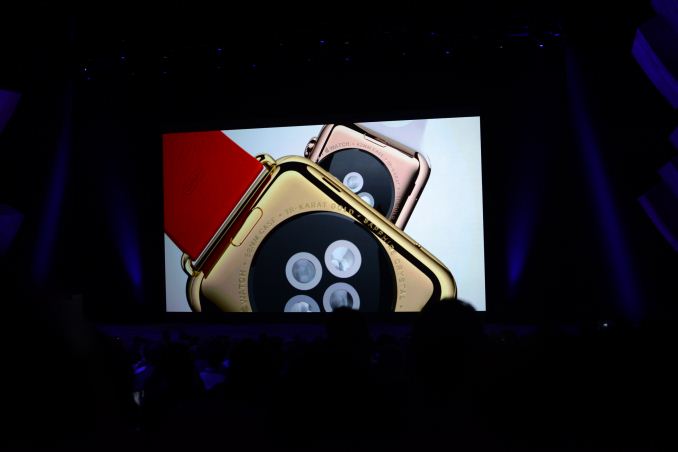
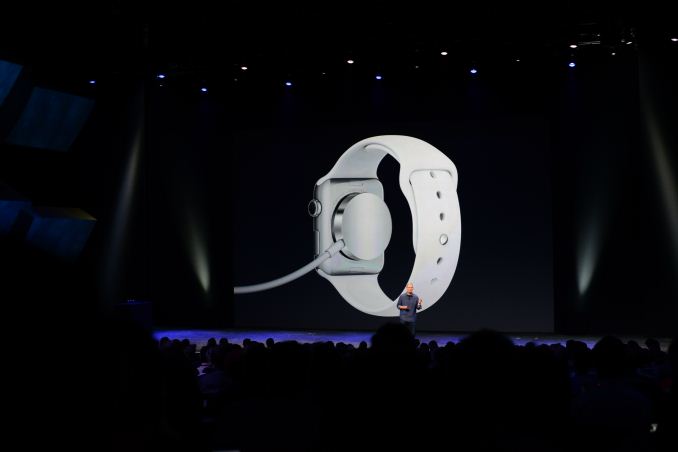
There are IR lights and sapphire lenses on the back of the watch for heart rate and serves as a magnetic alignment wireless charging system. The accuracy of the watch is no more than 50 milliseconds off at any time.

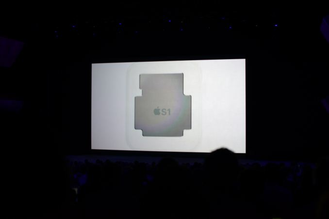
In order to support this watch, Apple has also designed a custom SoC called S1, likely for battery life and sensor integration and reduction of board area.

There are six different straps that are easily exchanged. The sport band has multiple colors and is some kind of rubber. There’s a leather sports strap which has multiple magnets to ensure that the fit works correctly. There’s also a traditional leather strap and a stainless steel link bracelet. There’s also a stainless steel mesh band that is infinitely adjustable. There are also two versions of each watch edition, one larger and one smaller.

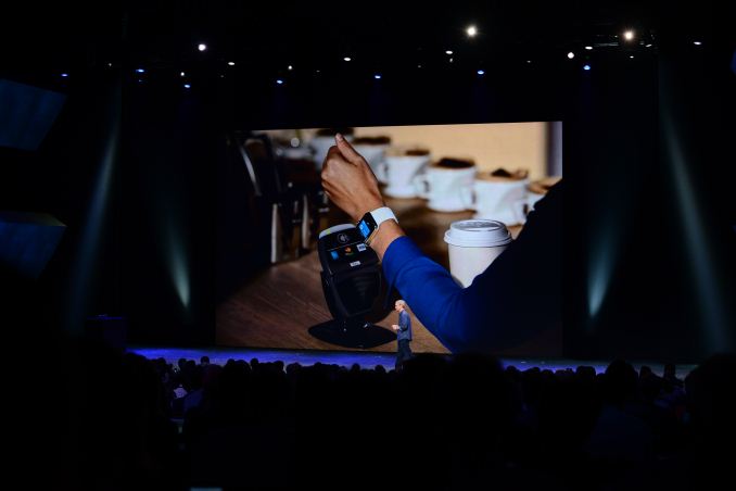
The Apple Watch also has NFC and will work with Apple Pay.

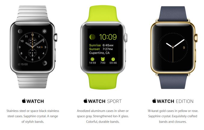
There are actually three variants though, which include the standard Apple Watch, Watch Sport, and the Watch Edition which has 18 karat gold for the casing. The sport edition has a anodized aluminum casing.

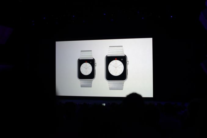
Furthermore the watch will also come in two different case sizes to account for different wrist sizes (essentially his & her watch sizes). These sizes are 38mm and 42mm tall respectively.

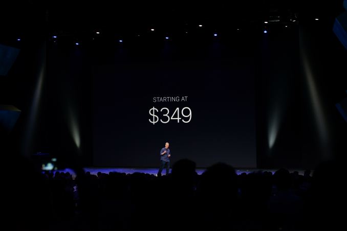
The Apple Watch must be paired with an iPhone to work properly. It starts at $349 USD and will go on sale early 2015.

Motorola Announces the Moto Hint

Motorola Announces the Moto Hint

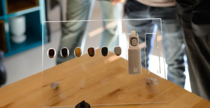
The Moto Hint is a new Bluetooth headset. While this is normally a bit boring, Motorola has put extra effort into this headset.

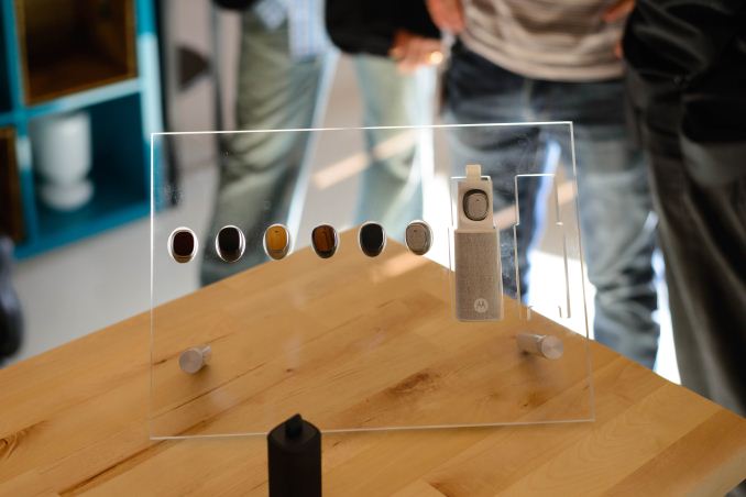
The size and shape is specifically made to fit in ears as well as possible and to make it less obvious than most headsets. The headset also has microphones which also serve as a method to access Google Now and Moto Voice on the new Moto X. One use case demonstrated was turn by turn navigation with the phone in a pocket and relying upon the headset for directions. There’s also a sensor that will automatically detect when the headset is removed from the ear and will shut off the headset upon detection. Finally, it will charge and store itself on a keychain charger if not in use.

The Moto Hint will go on sale later this fall. It will cost 149.99 USD in the US and will be available on Motorola’s website and expand to other regions in time for the holidays.

Motorola Launches the Moto 360: Hands On and First Impressions

Motorola Launches the Moto 360: Hands On and First Impressions

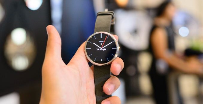
The Moto 360 at this point is one of the most hyped products I’ve seen this year. However, in my time with the product it seems to be a mostly standard Android Wear watch, but with a few major differences.

At the most basic level, this watch has a TI OMAP 3 for the main application processor. From a performance perspective the OMAP 3 is a solid and simple choice, packing a Cortex-A8 CPU alongside a PowerVR SGX 530 GPU, reflecting the fact that wearables don’t require anything near cutting edge performance. However this choice in SoC is oddly out of date on the manufacturing side as OMAP 3 was produced on a now dated 45nm process. Though the Moto 360 doesn’t need the performance benefits from from newer 28nm or 20nm processes, these newer processes can deliver similar performance with lower power consumption, which would seem to be a boon for a space and power constrained device such as a watch.

Otherwise, the specs are mostly within expectation. The LCD display is a 1.56″ size with 320×290 resolution, and is 46mm in diameter and 11.5mm thick. The leather strap model we’ve been sampled weighs 49 grams, and the battery has 320 mAh in capacity. Although the nominal voltage isn’t given it’s likely that it’s 3.8V. There’s 4 GB of internal storage and 512MB of RAM, a pedometer, heart rate monitor, two microphones, and the watch is rated for IP67 immersion protection, which means it is dust tight and submergable up to 1m of water for half an hour.

Motorola wanted to emphasize that this was a modern timepiece rather than a smartwatch, and they’ve implemented a great deal of new technologies in order to support the intended industrial/material design and user experience. The most obvious of these is the round display, which has no bezel except for the bottom of the watch. Unfortunately, it appears that this area at the bottom is necessary in order to fit the display driver and provide an area where ribbon cables can come out and meet the logic board.

In addition, we see custom antennas that are in the metal housing but don’t require any antenna lines. Unfortunately, there was no real disclosure on how this worked so it was hard to say how they pulled this off but there are noticeable patterns on the inside of the metal casing. New RF techniques were also used to make custom metal wristbands that don’t interfere with the antennas of the watch itself.

Motorola has also equipped the Moto 360 with dual microphones and custom noise cancellation profiles to handle different acoustics from being strapped to an arm, and it should be able to handle noisy environments better than most other Android Wear devices. The work done to enable this level of noise cancellation was done at Motorola’s main office in Chicago.

There’s also a recessed strap to improve comfort and better hug the wrist, and a custom heart rate sensor that should have better performance and reliability when compared to competing solutions.

The watch also only has wireless charging, and charging is as simple as placing the watch on the included dock. Putting the watch on the dock also automatically puts it into a custom charging mode that allows it to function as an alarm clock. It’s currently too early to judge battery life or the actual utility of the watch, but the watch was comfortable, with solid aesthetics and design.

It will start at 249.99 USD and will be available on the Motorola site, Google Play, Best Buy stores and the Best Buy website. The two metal band options will be available later this fall for 299.99 USD and the metal band will be available separately for 79.99 USD. Leather bands will also be available for 29.99 USD.

Sony SmartWatch 3 & SmartBand Talk Hands-On

Sony SmartWatch 3 & SmartBand Talk Hands-On

With Sony’s launch event we had the occasion to see their first Android Wear device. Sony presents the SmartWatch 3 and the SmartBand Talk wearable device watches. 

The SmartWatch 3 sports a 1.6″ 320×320 TFT LCD run by a 1.2 GHz quad-core ARM Cortex A7 SoC and powered by a 420mAh battery. We find 512MB of RAM and 4GB of system NAND. 

The device is IP68 certified even though it is charged by a standard microUSB port. There’s not much to say about the specifications of the watch as Sony has kept it pretty simple. Since Android Wear is not customizeable by OEMs, there is no differentiation between it and previous square Wear smartwatches.

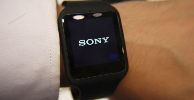
In terms of design, there’s only one way I would describe it: rubbery. With the rubber armband extending over the sides of the watch, we’re talking a lot of rubber. It feels like one of those child-watches that I remember keenly, only that it’s not coloured bright orange, which is kind of ironic because Sony will offer some gaudy colour options such as lime later in the wear. We only had black and white models available at IFA and the black one was already kind of odd looking.

I also found the device too be a bit too big for my taste, but then again I was never fan of big watches. The microUSB port is protected by a little cover which you need to keep lifted up while trying to plug in the cable. I found this very annoying as I couldn’t make the cover stay on the side while plugging the cable in – it’s so small and fiddly that it took me a good 20 seconds to connect it.

The other wearable is the SmartBand Talk. Sony markets it as a “lifelogger” device which tracks your movement via gyroscope and accelerometer and saves the data. The device also allows to be used pretty much as a bluetooth headset, just that it’s not a headset. You can talk to it and it has a little speaker. It has a 1.4″ curved narrow e-paper display that allows it to extremely power efficient. The band sports a tiny 70mAh battery.

Frankly, I’ll admit that I didn’t spend too much time with the SmartBand because I simply did not see any use for it. It kinda perplexes me and seems like some little gimmick gadget that you could just skip and get the real deal in the form of a full-fledges smart-watch.

All in all, Sony’s new wearables don’t seem to be any new groundbreaking inovation. It adds to the wearable ecosystem and I’m surely happy for that – but when it comes to actually buying one, I think people will find better options in devices from the competition.