Wearables


LG Replaces Android Wear: Adds LTE, GPS and NFC to the Watch Urbane

LG Replaces Android Wear: Adds LTE, GPS and NFC to the Watch Urbane

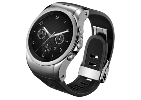
Today LG pre-announced significant additions to their high-end wearable, the LG Watch Urbane, via a new edition called the LG Watch Urbane LTE. Both devices will officially launch at Mobile World Congress next week. From a feature standpoint, the LG Watch Urbane LTE adds more wireless functionality via the inclusion of LTE, VoLTE (not 3G voice), GPS, and NFC.

These additions dramatically expand LG’s ability to cover the movement use case of wearables and places the Watch Urbane LTE alongside the Samsung Gear S as the only devices to include cellular functionality. This provides a safety net when making a fitness excursion, as emergency calls are now possible. LG had this use case in mind specifically as they included a single key press to initiate an emergency call. Additionally, the inclusion of NFC enables mobile payments, although LG has not yet provided details on how this works. Finally, LG has dramatically increased the battery size from 410mAH to 700mAH, which will help immensely with powering the LTE radio. I should note this is the largest battery I have seen to date in a wearable.

From an industry perspective, the most interesting part of this announcement is that LG has ditched Android Wear which was used for the non-LTE edition of the Watch Urbane. As Android Wear does not support NFC payments or cellular, this was a necessity to bring the Watch Urbane LTE to market, but it highlights that device makers like LG and Samsung are not waiting for Google to add functionality. Google needs to improve the pace of Android Wear updates if they want to keep their partners using the platform.

  LG Watch Urbane LTE LG Watch Urbane
SoC Qualcomm Snapdragon 400 1.2GHz Qualcomm Snapdragon 400 1.2GHz
Memory 1GB LPDDR3 512MB LPDDR3
Display 1.3″ plastic OLED (320 x 320, 245ppi) 1.3″ plastic OLED (320 x 320, 245ppi)
Storage 4GB eMMC 4GB eMMC
Wireless LTE, NFC, Bluetooth 4.0 Bluetooth 4.0
Ingress protection IP67 IP67
Battery 700mAH 410mAH
Sensors Gyro, accelerometer, compass, barometer, heart rate, GPS Gyro, accelerometer, compass, barometer, heart rate
I/O Touch screen, buttons, speaker, microphone Touch screen, buttons, microphone
OS LG Custom Android
“LG Wearable Platform Operating System”
Android Wear

Update: It appears the watch might not run a customized Android distribution but rather something more custom. LG describes it as “LG Wearable Platform Operating System”. Other news are reporting this as WebOS derived but nothing has been confirmed from LG. WebOS would be impressive considering we haven’t seen a version including VoLTE.

Price and availability remain unknown. Look for additional details as Mobile World Congress 2015 begins next week.

LG Replaces Android Wear: Adds LTE, GPS and NFC to the Watch Urbane

LG Replaces Android Wear: Adds LTE, GPS and NFC to the Watch Urbane

Today LG pre-announced significant additions to their high-end wearable, the LG Watch Urbane, via a new edition called the LG Watch Urbane LTE. Both devices will officially launch at Mobile World Congress next week. From a feature standpoint, the LG Watch Urbane LTE adds more wireless functionality via the inclusion of LTE, VoLTE (not 3G voice), GPS, and NFC.

These additions dramatically expand LG’s ability to cover the movement use case of wearables and places the Watch Urbane LTE alongside the Samsung Gear S as the only devices to include cellular functionality. This provides a safety net when making a fitness excursion, as emergency calls are now possible. LG had this use case in mind specifically as they included a single key press to initiate an emergency call. Additionally, the inclusion of NFC enables mobile payments, although LG has not yet provided details on how this works. Finally, LG has dramatically increased the battery size from 410mAH to 700mAH, which will help immensely with powering the LTE radio. I should note this is the largest battery I have seen to date in a wearable.

From an industry perspective, the most interesting part of this announcement is that LG has ditched Android Wear which was used for the non-LTE edition of the Watch Urbane. As Android Wear does not support NFC payments or cellular, this was a necessity to bring the Watch Urbane LTE to market, but it highlights that device makers like LG and Samsung are not waiting for Google to add functionality. Google needs to improve the pace of Android Wear updates if they want to keep their partners using the platform.

  LG Watch Urbane LTE LG Watch Urbane
SoC Qualcomm Snapdragon 400 1.2GHz Qualcomm Snapdragon 400 1.2GHz
Memory 1GB LPDDR3 512MB LPDDR3
Display 1.3″ plastic OLED (320 x 320, 245ppi) 1.3″ plastic OLED (320 x 320, 245ppi)
Storage 4GB eMMC 4GB eMMC
Wireless LTE, NFC, Bluetooth 4.0 Bluetooth 4.0
Ingress protection IP67 IP67
Battery 700mAH 410mAH
Sensors Gyro, accelerometer, compass, barometer, heart rate, GPS Gyro, accelerometer, compass, barometer, heart rate
I/O Touch screen, buttons, speaker, microphone Touch screen, buttons, microphone
OS LG Custom Android
“LG Wearable Platform Operating System”
Android Wear

Update: It appears the watch might not run a customized Android distribution but rather something more custom. LG describes it as “LG Wearable Platform Operating System”. Other news are reporting this as WebOS derived but nothing has been confirmed from LG. WebOS would be impressive considering we haven’t seen a version including VoLTE.

Price and availability remain unknown. Look for additional details as Mobile World Congress 2015 begins next week.
Pebble Announces the Pebble Time

Pebble Announces the Pebble Time

The original Pebble watch was arguably the first device in what is now a rapidly growing smartwatch segment of the wearables market. Since its release, the software of the Pebble has steadily improved, and Pebble has introduced various new color options as well as more premium version of the Pebble called the Pebble Steel. But even with all those changes, the fundemental hardware of the Pebble remained the same. Today Pebble has announced a brand new smartwatch called the Pebble Time, and it is what one could call a true successor to the original Pebble.

The Pebble Time retains many of the software features that users enjoy from the original Pebble. It’s compatible with every existing Pebble application and watchface, and it has the same battery life of up to seven days. But the hardware of the Pebble Time is significantly improved from the original Pebble. The area that most users will notice first is the new display. While the original Pebble used a black and white memory LCD, the Pebble Time uses a color e-paper display. The design and size of the watch is also improved, with the thickness of the case having been reduced to 9.5mm, which is 20% thinner than the original Pebble. The bottom of the case is also curved to fit more comfortably on the user’s wrist. 

On the software side of things, the Pebble Time uses a new interface that Pebble are calling Timeline. Essentially, the interface is a sequential list of the events that you have planned throughout the day, and the three buttons on the right side of the watch allow you to move to the past, present, or future of your daily timeline. Like the original Pebble, the Pebble Time works with both Android and iOS devices, but features like sending voice replies to incoming notifications are more limited on iOS.

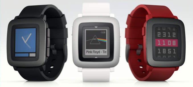
The Pebble Time will intiially come in black, white, and red. For their initial sales run Pebble has gone back to Kickstarter, the website where they originally began. The Pebble Time will retail for $199 when the Kickstarter campaign is over, but users who want to purchase one now can get it for $179 on Pebble’s Kickstarter campaign below.

Source: Pebble Time Kickstarter

Pebble Announces the Pebble Time

Pebble Announces the Pebble Time

The original Pebble watch was arguably the first device in what is now a rapidly growing smartwatch segment of the wearables market. Since its release, the software of the Pebble has steadily improved, and Pebble has introduced various new color options as well as more premium version of the Pebble called the Pebble Steel. But even with all those changes, the fundemental hardware of the Pebble remained the same. Today Pebble has announced a brand new smartwatch called the Pebble Time, and it is what one could call a true successor to the original Pebble.

The Pebble Time retains many of the software features that users enjoy from the original Pebble. It’s compatible with every existing Pebble application and watchface, and it has the same battery life of up to seven days. But the hardware of the Pebble Time is significantly improved from the original Pebble. The area that most users will notice first is the new display. While the original Pebble used a black and white memory LCD, the Pebble Time uses a color e-paper display. The design and size of the watch is also improved, with the thickness of the case having been reduced to 9.5mm, which is 20% thinner than the original Pebble. The bottom of the case is also curved to fit more comfortably on the user’s wrist. 

On the software side of things, the Pebble Time uses a new interface that Pebble are calling Timeline. Essentially, the interface is a sequential list of the events that you have planned throughout the day, and the three buttons on the right side of the watch allow you to move to the past, present, or future of your daily timeline. Like the original Pebble, the Pebble Time works with both Android and iOS devices, but features like sending voice replies to incoming notifications are more limited on iOS.

The Pebble Time will intiially come in black, white, and red. For their initial sales run Pebble has gone back to Kickstarter, the website where they originally began. The Pebble Time will retail for $199 when the Kickstarter campaign is over, but users who want to purchase one now can get it for $179 on Pebble’s Kickstarter campaign below.

Source: Pebble Time Kickstarter

Microsoft Band and Microsoft Health Updated

Microsoft Band and Microsoft Health Updated

This week Microsoft announced several updates for their wearable and health products: Microsoft Band and Microsoft Health. Microsoft stated that overall feedback has been positive, but as with any early technology, there was room for improvement.

To briefly recap the non-Band items from our Wearables 2014 article, Microsoft Health is a cloud service, such as OneDrive, that aims to help improve the health of its users through data analysis and actionable feedback (“insights”). Activity tracking devices and apps that connect to Microsoft Health publish data, with your permission, to the Microsoft Health server. Microsoft claims their cloud data framework and analysis provides the only total health service available. Additionally, Microsoft Health is referred to as an open platform, therefore other companies can interface with it as both publishers of data and subscribers of analysis. Microsoft Health also connects to another Microsoft service, HealthVault, which contains personal and family medical information and lab results.

Previously, users of Microsoft Health could only access their data and insights through a corresponding smartphone application. That changes this week with the launch of https://dashboard.microsofthealth.com (which is either ironically down or simply unavailable to those without a Microsoft Band). This is a welcome addition as smartphones, with their limited screen sizes, simply cannot match the information density of a well designed website. Microsoft was clear to state the dashboard will also work well from a mobile browser should you choose not to use the app- for example if you’re quickly using a friend’s phone.

Additionally, Microsoft Health has now officially rolled out the previously announced support to connect with MapMyFitness and Microsoft HealthVault. Users can visit the “Connected Apps” section of their dashboard to enable the integration.

The rest of the updates announced this week are for the Microsoft Band, and there are quite a few:

  • Bike Tile: The Bike Tile on users’ Microsoft Band lets them track their rides both indoors and outdoors, on the road or trail. Features include:
    • Heart Rate Monitor: When the Bike tile is active, the heart rate monitor is optimized specifically for biking activities.
    • Elevation Tracking: Track elevation and elevation gain, distance and duration and calorie burn– viewable in the Microsoft Health app. 
    • GPS: Users can activate GPS on their Band to map their ride in the mobile app and share it with their friends via email.
    • Speed Analysis: Track your current and average speeds both on the band and in the mobile app, and review your custom splits to relive those longer bike rides.
    • Recovery: From the mobile app, users can see an estimate for how long it will take their body to recover from the ride.
    • Web Dashboard: Biking functionality is supported by the Microsoft Health mobile app at launch. Integration with the Microsoft Health web dashboard is coming soon.
  • Guided Workouts: Five new indoor biking workouts have been added to the Guided Workouts portfolio, including: Indoor Bike Tabata Sprints, Indoor Bike Hour of Sweat, Indoor Bike Total Body, Indoor Bike Pyramid, and Indoor Bike Intervals.
  • Quick Read: Quick Read provides another option to scan incoming texts, emails and other notifications. When enabled, notifications are displayed in a large font size and in rapid succession of words enabling users to read messages while in motion and without the need to scroll.
  • Virtual Keyboard & Voice Replies for Windows Phone 8.1 Users: Windows Phone 8.1 users can craft replies to text messages in two ways. Users can reply to text messages using the virtual keyboard with minimal errors with the help of Microsoft’s World Flow technology, which predicts commonly used words and phrases. They can also dictate responses with voice, powered by Cortana.

Generally, the band is now suitable for biking, and Quick Read and Virtual Keyboard are added to bolster the smart watch use case. From my own experience wearing a Moto360, the Quick Read and Virtual Keyboard functionality are interesting. Receiving a text message appropriately vibrates my wrist with the Moto360, but I need to tap and slide the display around to read the contents. It appears Quick Read can save that extra step.

The Virtual Keyboard honestly sounded impossible to pull off on such a small display, and since I lack a review unit I can not try it. Windows Central has a write up and video of the functionality and it is truely impressive.

The keyboard is an option when replying to text messages and it uses similar technology present in Windows Phone 8.1, Word Flow. Anand has written about Word Flow before. This is an welcome addition, as using voice recognition simply is not perfect yet. I have sent too many voice dictated replies to my wife that state “at the Jim” or something even less recognizable.

Finally, Microsoft has unveiled the Microsoft Band SDK Developer Preview, enabling iOS, Android, and Windows Phone apps to access the Band’s sensors and create tiles linked to the application on the Band itself.

Thankfully, as every wearable (save the Samsung Gear S) lack cellular connectivity, there is typically no lengthy mobile operator validation delay. The Microsoft Band update is rolling out starting yesterday and should arrive at all owners within a few days.