Wearables


Understanding Project Soli and Jacquard: Wearable Control Breakthroughs

Understanding Project Soli and Jacquard: Wearable Control Breakthroughs

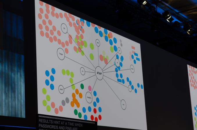
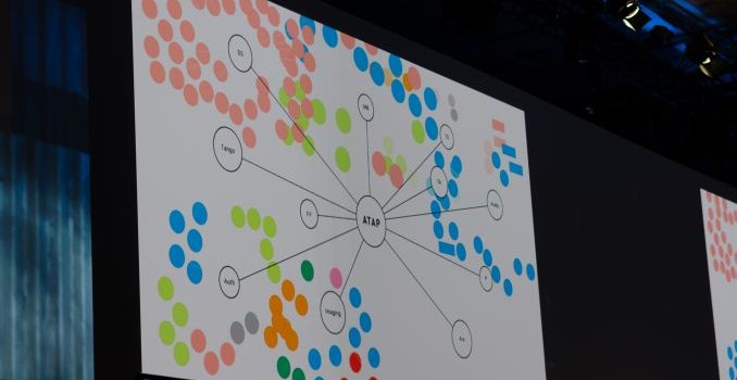
Today at Google IO, Google’s Advanced Technologies and Products (ATAP) group went over some of the things that they’ve worked on in the year since the previous IO. There are a few different things that they’ve worked on, but the most immediate and important announcements were centered on technologies to enable wearable technologies. These two announcements were Project Soli and Jacquard, both focused on solving the challenges involved with input on wearables. Although wearables are on the market today, one of the biggest problems with Android Wear and most wearables in general is that an almost purely touch-based interface means that almost any touch target has to take up a huge part of the display in order to make sure that it’s possible to reliably hit the touch target.

Google’s ATAP group noticed that this limitation is partially due to processing limitations of the brain, which varies for different parts of the body. Something like the elbow has very little sensation and cannot be finely placed. ATAP’s research indicates that the fingers by comparison has 20 times the processing bit rate, and therefore can be used to provide precise input.

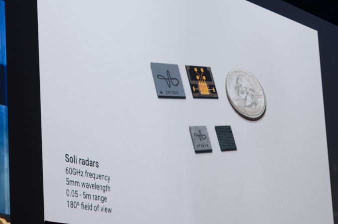
For ATAP, the logical conclusion to this was Soli, a new single-chip solution for detecting finger motion and gestures. Soli is fundamentally a different approach to conventional solutions like capacitive touch screens which lack the ability to detect 3D motion and camera movement detection systems like Kinect which cannot accurately detect fine motion. The solution here is said to be 60 GHz radio, which has a sufficiently high frequency that it is relatively reflective with sufficient resolution to distinguish fine motion like a capacitive touch display. It was also said that the transmitter has a wide cone-like spread rather than scanning with a fine beam of radio waves, which helps to drive down cost. The current solution uses two transmitters and four receivers, which presumably helps with improved noise rejection and accurate reading of multiple fingers. Given the extremely high frequency, it’s also a pretty fair bet that we’re looking at a superheterodyne architecture but unfortunately I was unable to get a confirmation on this from ATAP representatives.

With this hardware, and a lot of proprietary algorithms that leverage machine learning/deep neural nets, it becomes possible to track extremely fine gestures. Something as simple as tapping your index finger with your thumb could be equivalent to tapping a button, and swiping your thumb against your index finger could be equivalent to scrolling on a touch screen.

Clearly, there’s a ton of possibilities with such technology, and probably the most obvious one is using this to enable a seamless experience with wearables like Google Glass, which suffers from poor user interface as it relied on head motion and touching the glasses itself to navigate the UI. ODG had an interesting finger-mounted controller, but it was obvious that it would be easily lost and was inherently somewhat clunky due to the number of controls that had to be integrated. The demos tended to focus on smartwatches, but my experience with the Apple watch suggests that the addition of Force Touch and the digital crown in addition to the touchscreen really resolves most of the problems that come with small display of smart watches. The real benefits really start to appear when in the context of other types of wearables.

The other technology that ATAP unveiled was named Jacquard, which is a bit less impressive from a pure technology perspective but definitely interesting from a manufacturing perspective. In short, Jacquard is a way of weaving capacitive touch digitizers into cloth.

According to Google, there were two major challenges in enabling Jacquard. The first was that pre-existing conductive yard had incredibly high resistance at 15 ohms per meter while 22 AWG copper wire has a resistance of .053 ohms per meter, or around 280 times higher, which makes it incredibly difficult to implement a good touch display of any significant size. In addition, there was only a single color. The other problem was that no one had attempted to try and deeply integrate so many wires in a fabric before, and the ATAP team faced many challenges when it comes to connecting the wires to logic once they’ve been woven into the fabric to actually make the touch screen useful.

To solve the problem with connecting a touch panel to the fabric, Google managed to get a special type of weaving done in order to expose the conductive strands of yarn in a specific order to allow fast and simple connection to connectors. In order to solve the problem of high-resistance yarn, ATAP made their own type of yarn to enable this technology with a low resistance that is only around twice as high as 22 AWG copper wire, and can be made in almost any color or material.

 Although there are effectively no details on the actual process, which is likely to be a trade secret, it is said that this cloth works without issue in pre-existing textile machines. To demonstrate this, they showed off a tailored jacket made with Jacquard touch-sensitive material to prove that this technology can seamlessly blend with fashion. The result is that it becomes possible to have much larger touch panels on wearable devices due to their effectively invisible nature. Given that Levis has already partnered with ATAP for this project, I suspect that this is closer to commercialization than Soli. Overall, these two projects clearly solve user experience problems in wearables, but it remains to be seen whether they can make these prototypes into mass-market products.

Microsoft Health and Band Updates Bring New Cycling App Integrations, Insights and Features

Microsoft Health and Band Updates Bring New Cycling App Integrations, Insights and Features

Today Microsoft launched a new update to their fitness wearable, Microsoft Band, and also to their health platform and smartphone app, Microsoft Health. These updates broaden the capabilities of features of each by integrating with third party apps and services, implementing new health insights (analysis), and enhancing the Microsoft Health app to now work stand-alone without a paired Microsoft Band.

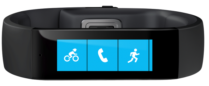
The new update enhances the bike activity tile added in Feburary to now integrate with activity tracking apps Strava and MapMyRide. After this update is installed, the Strava and MapMyRide apps can harvest activity data from the Microsoft Band. Microsoft does not state if this data harvesting is continuous or a one time download after an activity is complete. Personally, I believe Strava integration is a huge boon to the Microsoft Band. In my experience, many members of the cycling community use Strava and cylcing computers to track their rides. My brother, an avid cyclist, has mentioned interest in the Microsoft Band, but without Strava integration he continued to rely on a cycling computer and a chest mounted heart rate monitor.

Microsoft’s cloud analytics platform, Microsoft Health, has also been updated to provide new “Insights” into the body and health of an individual. These new insights are available via the web dashboard starting April 27th and are listed below:

  • Comparative Insights: Measures data such as daily steps, sleep, workout frequency and calorie burn and compares it to similar Microsoft Health customers based on body type (height and weight). Customers looking for motivation can use comparative insights as a benchmark to understand their health relative to similar people.
  • Sleep Recovery: Good sleep is the foundation of health, and something everybody does and needs. Microsoft Band tracks the length and quality of sleep. Use the Microsoft Health web dashboard to analyze sleep restoration, sleep efficiency, and wake-ups, to find out how well the body restores its resources during sleep.
  • Fitness Benefit: Track fitness progress using historical data to measure improvement over time.
  • VO2 Max: VO2 max refers to the maximum volume of oxygen used during exercise, and is the primary indicator of cardiovascular fitness. Traditionally, measuring VO2 Max is cumbersome. Not anymore. Microsoft Band estimates VO2 max based on heart rate information. Now customers can track how their VO2 max increases as they improve fitness level and achieve their wellness goals, simply.
  • Run/Exercise Observations: Get more out of run and workout data with in-depth observations and insights. With a week of data, customers can determine which day of the week and at what time of day they perform best. Using historical data from as far back as five weeks, customers can track whether they’re maintaining, progressing, or need to re-dedicate themselves. Analyze detailed stats to find specific aspects of runs and workouts that can be improved.

Particularly interesting is the VO2 Max calculation. This analysis is traditionally performed by specialized equipment, typically as a paid service at a gym. Microsoft has always stated their cloud platform will provide innovative analysis, and if this Insight is close to the traditional VO2 Max measurement, then Microsoft has delivered. Additionally, I personally appreciate the historical and comparative analysis as it provides a great motivational tool.

Finally, Microsoft will update the Microsoft Health smartphone app on all platforms in the coming weeks to provide activity measurements directly, without use of a Microsoft Band. On the surface this is a surprising development, as it is in Microsoft’s best interest to sell hardware. However, upon further thought this makes sense. Microsoft can provide a limited set of analysis using the smartphone sensors, engage the user into Microsoft Health services and offer the Microsoft Band as an up sell for more complete activity tracking. Device support is limited to smartphones with a dedicated microcontroller co-processor for sensor data, which is most modern devices.

  • iOS: iPhone 5s and later
  • Android: Android 4.4+ with support for Step Counter API
  • Windows Phone: Lumia devices with Sensor Core V1+ and Cyan Firmware

Some of these updates are available today, such as the biking app integration, while others will roll out over the next few weeks.

Android Wear Updates: Wi-Fi, Always-On Apps and Usability

Android Wear Updates: Wi-Fi, Always-On Apps and Usability

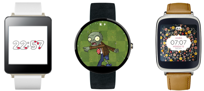
This week Google announced the latest update to their smart watch focused operating system, Android Wear. Google did not specify the exact version number, but the previous version was 1.0.5 and each release has bumped the last digit, so best guess is this is version 1.0.6. This update adds three main features: Wi-Fi support, Always-On application support, and several welcome usability upgrades.

The most significant feature from a technical and business standpoint is the addition of Wi-Fi support. Although it is not clear which (if any) existing Android Wear devices have Wi-Fi hardware to take advantage of software Wi-Fi support, this will absolutely help Google attract device manufacturers to deploy Android Wear instead of something custom such as Tizen or otherwise. As device manufactures deploying Android Wear can only differentiate themselves via hardware, continued hardware feature additions by Google become important. For example, a new Android Wear device launching with this update could possibly boast a first-with-Wi-Fi title. We should expect to see this continue for other presently missing major features such as LTE and camera.

As for the Wi-Fi experience, Google is not exactly clear. Their description of the feature’s utility is in one sentence: “As long as your watch is connected to a Wi-Fi network, and your phone has a data connection (wherever it is), you’ll be able to get notifications, send messages, and use all your favorite apps.” This description hints that Google is using a cloud service to connect the phone and watch together, therefore eliminating the device to device range aspects of Bluetooth pairing. This is both more and less than expected. I personally love the idea of using Wi-Fi as a range extender, as I often walk away from my desk and leave my phone far behind only to notice later when my watch complains of no connection. However, I would have also expected Wi-Fi to be exposed to apps somehow for watch-to-thing type interactions. For example, pressing a button on the watch to change the channel on a Kodi media center. That may still be possible with this update- Google simply has not provided details yet.

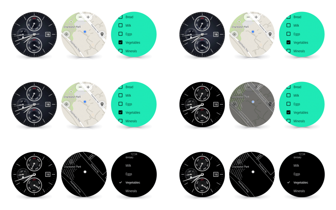
Also in this update is a new feature for applications: Always-On. Previously, all Android Wear applications were subject to a timeout and developers were advised not to rely on continuous screen time. In fact, the developer’s guide still contains this now-outdated information. Always-On allows an application which is in full-screen-mode (not simply showing a Google Now banner) to register for permanent display. This pardons the app from the shutdown timeout and therefore keeps it front and center even after the wearer lowers their arm. As Android Wear always returns to the watch face when an app times out, this can save a considerable amount of navigation if the wearer is repeatedly pulling up the same app during an activity such as checking a shopping list. Google has retained the wrist raise-and-twist detection to detect if the wearer is actively looking at the display, and will turn the display black and white if it determines the watch has been lowered from view. Google claims this saves battery life, but in practice this is really only going to be the case for OLED based devices, as the power savings on a LCD based device are going to be minimal (maybe a slight reduction in backlight intensity).

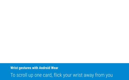
With regards to usability updates, Google has added a new gesture to scroll through notifications via wrist twisting. This allows a wearer to view details without reaching over with the other hand to touch the display, to aid in situations where the wearer’s hands are full. I am personally excited about this update as it was often faster to reach into my pocket with the other hand and retrieve my phone than it was to touch the watch display. The smart watch still had utility if I was not near my phone or my hands were both free, but this update should expand its utility farther.

Google has also resolved the absolutely bizarre way that apps had to be launched in the previous versions of Android Wear. From the watch face, the wearer had to tap the screen, scroll to the bottom of a very long list of actions and select the ambiguous “Start…” action to then be presented with the application list. This was far from intuitive. In this update, apps, contacts, and that long list of actions are surfaced in a single sliding pane behind a single tap of the watch face.

Google has also (finally!) added the ability to ask the watch to find the paired phone. Google has not yet described how this feature works, but I am thankful this obvious feature has arrived. It is quite silly, but I often find myself receiving many notifications and have no idea where my phone is- resulting in a frantic search while my wrist continues to vibrate.

Finally, Google has added the ability to reply to messages with a drawn emoji. Presently, this seems impossible to execute well on such a small screen so I look forward to testing this myself. The example Google provides is below, and seems completely implausible unless people are better finger artists than I would expect.

The update is being deployed over the next several weeks to all Android Wear devices, starting with the LG Watch Urbane. The Moto 360 I am using has not yet received the update.

Motorola Launches Moto Maker for the Moto 360

Motorola Launches Moto Maker for the Moto 360

In August of 2013, Motorola launched an innovative web portal, Moto Maker, enabling personalization of the original Moto X immediately prior to purchase. Almost two years later, Moto Maker remains the most comprehensive offering for phone personalization in the industry. While I do not know how many Moto Xs have been sold instead of rival devices due to Moto Maker, anecdotally, the owners of customized Moto X devices always stand out.

Today, Motorola has expanded Moto Maker to include the Moto 360. Watch design preference is very personal so implementing a Moto 360 version of Moto Maker is a natural extension of an existing Motorola capability. This announcement likely also signals Motorola does not intend to replace the Moto 360 soon- despite its aging OMAP 3 processor which was not optimized for the wearable use case.

At launch, the Moto 360 was available with a black or stainless steel case. Leather bands were available in in either black or grey. Since then Motorola launched a metal band variant and allowed purchase of bands separate from the device. Bands can be installed to the Moto 360 with a jewelry tool but Motorola recommends taking the watch to a jeweler.

Todays announcement expands the total available color and material options for the case and bands and also ensures Motorola combines the desired band and case before shipping. Case choices have been expanded to three with the addition of a champagne gold finish option for an extra $30, and band choices have expanded to nine with metal commanding an extra $50. It is odd that the case’s gold finish costs an extra $30 when the same gold finish on the metal band carries no extra cost. See the selection images from Moto Maker below.


Moto Maker also allows you to select the watch face. As an Android Wear user, I find this odd. The watch face is one of the first things setup in the device pairing experience, and can be changed at any time. However, for potential buyers, this provides a previously unavailable preview of the device with many different watch faces. I realize Motorola could not include everything in Moto Maker, but simply selecting a canned watch face is a bit misleading. When you own the device, each of these faces can be further customized. For example, size and color of tick marks and/or background images can be changed.

While making selections, the center of the website updates showing a live preview of your choices. Unlike the Moto X, there is no interactive 3D view available, but instead there are 5 canned views that provide good coverage.

To give the Moto Maker for Moto 360 a spin yourself, hit the Moto Maker Design Studio.

Motorola Launches Moto Maker for the Moto 360

Motorola Launches Moto Maker for the Moto 360

In August of 2013, Motorola launched an innovative web portal, Moto Maker, enabling personalization of the original Moto X immediately prior to purchase. Almost two years later, Moto Maker remains the most comprehensive offering for phone personalization in the industry. While I do not know how many Moto Xs have been sold instead of rival devices due to Moto Maker, anecdotally, the owners of customized Moto X devices always stand out.

Today, Motorola has expanded Moto Maker to include the Moto 360. Watch design preference is very personal so implementing a Moto 360 version of Moto Maker is a natural extension of an existing Motorola capability. This announcement likely also signals Motorola does not intend to replace the Moto 360 soon- despite its aging OMAP 3 processor which was not optimized for the wearable use case.

At launch, the Moto 360 was available with a black or stainless steel case. Leather bands were available in in either black or grey. Since then Motorola launched a metal band variant and allowed purchase of bands separate from the device. Bands can be installed to the Moto 360 with a jewelry tool but Motorola recommends taking the watch to a jeweler.

Todays announcement expands the total available color and material options for the case and bands and also ensures Motorola combines the desired band and case before shipping. Case choices have been expanded to three with the addition of a champagne gold finish option for an extra $30, and band choices have expanded to nine with metal commanding an extra $50. It is odd that the case’s gold finish costs an extra $30 when the same gold finish on the metal band carries no extra cost. See the selection images from Moto Maker below.


Moto Maker also allows you to select the watch face. As an Android Wear user, I find this odd. The watch face is one of the first things setup in the device pairing experience, and can be changed at any time. However, for potential buyers, this provides a previously unavailable preview of the device with many different watch faces. I realize Motorola could not include everything in Moto Maker, but simply selecting a canned watch face is a bit misleading. When you own the device, each of these faces can be further customized. For example, size and color of tick marks and/or background images can be changed.

While making selections, the center of the website updates showing a live preview of your choices. Unlike the Moto X, there is no interactive 3D view available, but instead there are 5 canned views that provide good coverage.

To give the Moto Maker for Moto 360 a spin yourself, hit the Moto Maker Design Studio.