Today Huawei launches the successor to the Ascend Mate, the Mate 7 and a new mid-range device called the Ascent G7. I’ve got my hands on a Mate 7 and managed to play a bit with the G7 today at Huawei’s event in Berlin. The Mate 7 directly attacks Samsung’s Note lineup in the phablet sector, while the G7 being still very big at 5.5″ is more of a budget device while trying to make little compromises.
First up, let’s see the raw specs that both devices offer.
|
|
Ascend Mate 7 |
Ascend G7 |
|
SoC |
Hi3630 “Kirin 925”
4xCortex A15 @ 1.8GHz
4xCortex A7 @ 1.3GHz
Mali T628MP4 GPU @ 600MHz |
MSM8916 “Snapdragon 410”
4xCortex A53 @ 1.2GHz
Adreno 306 GPU |
|
RAM/NAND |
2 GB LPDDR3 & 16GB NAND or
3GB LPDDR3 & 32GB NAND
& microSD
|
2GB LPDDR3, 16GB NAND
& microSD |
|
Display |
6″ 1080p JDI IPS-NEO |
5.5″ 720p IPS |
|
Network |
2G / 3G / 4G LTE FDD & TDD
(HiSilicon Balong IP block UE Category 6 LTE) |
2G / 3G / 4G LTE FDD or TDD
(Qualcomm MDM9x25 IP block UE Category 4 LTE) |
|
Dimensions |
157 x 81 x 7.9mm, 185 grams |
? x ? x 7.6 mm, 165 grams |
|
Camera |
13MP Sony IMX214 BSI sensor,
F/2.0, 28mm wide angle lens
5MP FFC non-spherical lens
|
13MP Sony IMX214 BSI sensor,
F/2.0, 28mm wide angle lens
5MP FFC 88° angle lens
|
|
Battery |
4100 mAh, 3.85V, 15.78 Whr |
3000 mAh, 3.85V, 11.55 Whr |
|
OS |
Android 4.4.2 with EmotionUI 3.0 |
Android 4.4.2 with EmotionUI 3.0 |
|
Connectivity |
802.11a/b/g/n/ac + BT 4.1, USB2.0, GPS/GNSS, MHL, DLNA, NFC |
802.11a/b/g/n/ac + BT 4.1, USB2.0, GPS/GNSS, MHL, DLNA, NFC |
|
SIM Size |
MicroSIM & NanoSIM |
MicroSIM & NanoSIM |
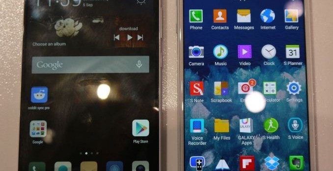
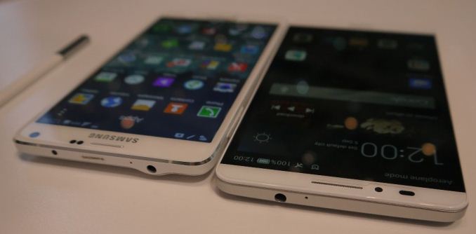
Let’s start up with the Ascend Mate 7. The first thing you notice is that this is a big device. Coming with a 6″ screen this is one of the bigger candidates in the phablet space. What Huawei has done is reduce the bezels on the device as much as possible, that in the end the resulting device dimensions only slightly outsize the newly announced Note 4 with its 5.7″ screen. The new JDI manufactured IPS-NEO screen promises a constrast ratio of 1500:1 and also brings with it increased brightness and reduced power, with Huawei stating 15% better transmissitivity and 15% reduced power consumption. We’ll be sure to test this display to the fullest extent, as at first glance it seems outstanding. Filling up a 83% bezel-to-device-footprint ratio this is currently the most “screen” on a device out there. I have to point out that Huawei was very misleading in its rendered presentation pictures as it portrayed the phone as such that it gave an impression that the screen begins immediately where the bezel ends, however in reality there’s another 3mm of black nothingness on both sides before you meet the first pixels.

The same HiSilicon Hi3630 powers the Mate 7 that was released for the Honor 6, however it gets a slight 100MHz clock boost on the A15 cores and gets brandished as the Kirin 925. I made sure to ask a Huawei representative if we’d see various regional models offering various connectivity options, and to my delight this time we have full use of the Balong category 6 LTE modem provided in the SoC as the device offers full RF and antenna support for both FDD and TDD on the global model. Only variations will be select Chinese models which need to support a wider range of TDD bands to take advantage of their national carrier’s networks. This is all backed by two redundant antennas on the top and bottom of the device. Apparently the device is able to switch between them as the main connectivity antenna if the attenuation on either gets too high due to external influences like gripping or holding the device. Huawei reports a 40% reduction in call drops and a 15dB gain in signal strength.
Huawei was trying to praise a so called i3 co-processor, but this is something that devices have had since the Note 2 in the form of external “sensorhubs” which are most of the time little ARM Cortex M3 microcontrollers, with Qualcomm first integrating them into their SoCs such as the Snapdragon 800.

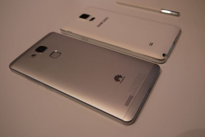
The body of the Mate 7 houses an enormous 4100mAh battery offering 15.78Wh of power: this is more battery capacity than found in the Nexus 7 2013, but inside a phone. Huawei made this possible by dedicating a very large amount of internal device space to the battery alone, with it taking the whole width of the device and filling up from the top of the bottom bezel up to the fingerprint sensor in height. This is all encased in an aluminium body and keeping a thickness of 7.9mm at the thickest point in the center of the device. Even though it is made of aluminium, the device is still able to offer NFC with help of a little gap above the camera and the NFC coil surrounding the camera and flash; the top and bottom parts of the Mate 7 remain plastic. Huawei tried to spin a 3.5mm thickness at the edges, but I’d say 5mm is the more realistic measurement that we see on the sides of the device. The ergonomics are very pleasing and the build quality is top notch.
On the bottom we find a standard microUSB 2.0 connector, which is oddly enough not in the very middle of the device and makes for a strange asymetry in terms of design. The power button is found on the right side at thumb’s reach and the volume rocker is located right above it. On the left side we have the main SIM tray and the secondary tray that may house both a nanoSIM and a microSD card, which by the way means the phone has full dual-SIM capabilities.

The camera setup is relatively established while offering the same IMX214 camera sensor as found on the Honor 6. The G7 offers by the way the same optics system. The F2.0 28mm wide angle lens is a welcome addition that I hope more manufacturers would adopt. On the front camera we see a 5MP sensor, and with something Huawei names a non-spherical lens, which I’ll have to investigate more to see what it brings.
The main attraction of the Mate 7 is the new fingerprint sensor found below the back camera. This is a touch-sensor manufactured by Swedish company FPC, which may be the FPC1020 that was announced late last year. As such, Huawei is the first manufacturer following Apple’s TouchID to offer a full touch sensor as opposed to a swipe implementation as found on Samsung’s devices. It offers full 360° print rotation readout support, no matter if you have wet fingers or not. Huawei implements a RF sensing ring around the sensor that makes it possible to detect your finger even when the device is sleeping (as it will wake the device up). This allows for turning on of the devie and unlocking in a single action. I tested out the feature and it works perfectly. The fingerprint registration is identical to Apple’s, with you having to press your fingerprint multiple times for better characterization of your fingerprint. The success rate was near 100% for what I didn’t consider a very serious registration procedure on my part. The touch sensor can also be used as a camera shutter button when taking photos.
On the software side we see an update of EmotionUI to version 3.0. I’ve been working on the Honor 6 review for the last few weeks which had version 2.3 on it, and the change is quite enormous as we go for a full redesign from 2.x’s pre-iOS 7 style to literarly a new design language that seems to outright copy iOS 7 in many aspects. I’ll dwell into the software more in the following weeks, but I can already say that this is now my favorite custom Android framework and skin implementation out of all OEMs out there, as it brings not only design, but also a termendous amount of exclusive and useful features with it.

The G7 on the other hand is a more mixed bag. It is a 5.5″ 720p phone with a new Snapdragon 410 SoC, and is rightfully so a mid-range phone priced at 299€. As mentioned before, it offers the same camera setup as the Mate 7. The 7.6mm thin body housing a 3000mAh battery (which at time of writing I now considered small compared to the Mate 7’s) is made out of plastic and was noticeably less impressive than the Mate 7’s. Huawei didn’t communicate its exact dimensions but it felt similar in size to the G3 considering both have 5.5″ screens. I really don’t have that much to say about it, and neither did Huawei as the presenter at the unveiling offered an excrutiating 12 minute presentation with very little substantial content.

The Huawei Ascend Mate 7 and the G7 both come in either silver and gold, with the Mate 7 and G7 having each respectively an additional option of black and grey. At 499€ for 2GB/16GB and 599€ for the 3GB/32GB models the Mate 7 will be available end of october in China and Hong Kong and UK, Germany, Italy, France and Spain in Europe, with a global launch following that. The G7 with its 299€ MSRP will be available end september in Germany, Italy, Spain, Denmark, Hungary, the Netherlands Turkey, Poland, Norway, South Africa and Mexico, with other markets to follow.
Least to say I was impressed by the Mate 7. It seems like a great device overall – I know that the SoC has some faults (specially GPU performance) and you will be able to read about that soon as I finish up the Honor 6 review, however the phone’s build quality, great screen, connectivity features and gigantic battery all make up for it.

