Smartphones


The Motorola Moto G4 and G4 Plus Review

At this point in time, I don’t think the Moto G line needs any introduction. With the original Moto G in 2013 Motorola really went beyond what was thought to be possible in a mid-range smartphone. At that point in time, buying a $200 smartphone usually meant buying some Samsung or LG phone with a name nobody had ever heard of, and specs that left much to be desired. The Moto G showed that you could create an Android phone with an HD display, good performance, a good build, and good battery life at a price under $200. This year marks the fourth version of Motorola’s mid-range smartphone. Read on for the full AnandTech review of the Moto G4 and G4 Plus.

Meizu M3E Launched: Helio P10, 5.5-inch Full HD, ¥1299

Meizu M3E Launched: Helio P10, 5.5-inch Full HD, ¥1299

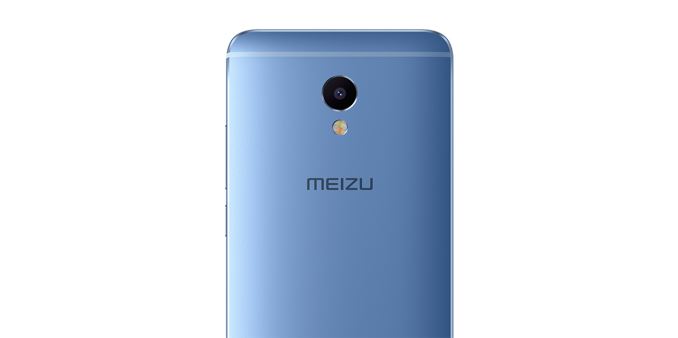
Today at a launch event in Beijing, Meizu announced the latest edition to its lower-cost M-series of smartphones. The M3E adheres to Meizu’s established design and construction methods, with an all-aluminum chassis topped with 2.5D edge-to-edge cover glass. The single-piece volume rocker and power button sit within a polished groove that matches the polished, chamfered edges around the sides as well as the recessed rear camera and flash modules. The M3E comes in five colors: silver, gray, blue, gold, and rose gold.

Like Meizu’s M3 note, the M3E comes with a fully laminated, 5.5-inch 1080p IPS LCD display with a peak brightness of 450 nits, according to Meizu. There’s a touch-based, capacitive fingerprint sensor below the screen that also works as a capacitive back button when tapped and a home button when pressed. Swiping up from the lower bezel opens the recent apps menu, which eliminates the need for additional capacitive or onscreen navigation buttons.

Technical Specifications
  Meizu M3E Meizu M3 note
SoC MediaTek Helio P10
(MT6755M)

4x Cortex-A53 @ 1.8GHz
4x Cortex-A53 @ 1.0GHz
Mali-T860MP2

MediaTek Helio P10
(MT6755M)

4x Cortex-A53 @ 1.8GHz
4x Cortex-A53 @ 1.0GHz
Mali-T860MP2 @ 546MHz

RAM 3GB LPDDR3 2GB / 3GB LPDDR3
NAND 32GB (eMMC 5.1)
+ microSD
16GB / 32GB (eMMC 5.1)
+ microSD
Display 5.5-inch 1920×1080 IPS LCD 5.5-inch 1920×1080 IPS LCD
Dimensions 153.6 x 75.8 x 7.9 mm
172 grams
153.6 x 75.5 x 8.2 mm
163 grams
Modem MediaTek (Integrated)
2G / 3G / 4G LTE (Category 6)

FDD-LTE / TD-LTE / TD-SCDMA / WCDMA / CDMA / GSM

MediaTek (Integrated)
2G / 3G / 4G LTE (Category 6)

FDD-LTE / TD-LTE / TD-SCDMA / WCDMA / CDMA / GSM

SIM Size 2x NanoSIM (dual standby) 2x NanoSIM (dual standby)
Front Camera 5MP, f/2.0 5MP, f/2.0
Rear Camera 13MP, 1/3.06″ Sony IMX258 Exmor RS, 1.12µm pixels, f/2.2, PDAF, HDR, dual-tone LED flash 13MP, 1/3.06″ OmniVision OV13853, 1.12µm pixels, f/2.2, PDAF, HDR, dual-tone LED flash
Battery 3100 mAh
non-replaceable
4100 mAh (15.79 Wh)
non-replaceable
Connectivity 802.11b/g/n/ac, BT 4.1 LE, GPS/GNSS, USB Type-C 802.11b/g/n/ac, BT 4.0 LE, GPS/GNSS, microUSB 2.0
Launch OS Yun OS 5.1 with Meizu Flyme OS 5 Android 5.1 with Meizu Flyme OS 5.1
Launch Price
(No Contract)
¥1299
$196 USD
¥799 / ¥999
$120 / $150 USD

The table above shows significant overlap between the new M3E and the M3 note. They both use the same MediaTek Helio P10 SoC with four ARM Cortex-A53 CPUs at up to 1.8GHz and another four at up to 1.0GHz in a big.LITTLE arrangement. There’s also an ARM Mali-T860MP2 GPU, which features two ALUs per core instead of three ALUs per core like the high-end Mali-T880.

In our M3 note review, the Helio P10 delivered adequate performance for light workloads, but could not match the speed and user experience of Qualcomm’s Snapdragon 650 SoC in the similarly priced Xiaomi Redmi Note 3. The Helio P10’s low-power GPU is also unsuitable for serious gaming, but is sufficient for playing casual titles.

The M3E comes with 3GB of LPDDR3-1866 RAM and 32GB of eMMC 5.1 NAND, also like the M3 note. Both phones also support microSD cards for storage expansion and 802.11ac Wi-Fi, which is nice to see at this price point, but neither phone includes NFC. The M3E at least ditches microUSB in favor of the newer Type-C port.

MediaTek’s Category 6 LTE modem comes integrated with the Helio P10 SoC, offering up to 300 Mb/s down and 50 Mb/s up with 2×20 MHz carrier aggregation and 64-QAM on the downlink. Both the M3E and M3 note accept dual NanoSIM cards and support Dual SIM Dual Standby (DSDS) operation. Meizu says the M3E supports 18 frequency bands, which is the same number as the mainland China version of the M3 note. Based on the hardware similarities, it’s likely the M3E supports the same frequency bands as the M3 note, which means no support for North American LTE frequencies.

The M3E comes with a 5MP front-facing camera and 13MP rear camera with phase detect autofocus (PDAF); however, the M3E is using a Sony IMX258 image sensor for the rear camera. The M3 note’s camera performed poorly in our testing, so hopefully this change improves image quality.

Overall, the M3E appears to be a minor revision of the M3 note. It’s updated design, USB Type-C port, and new rear camera are offset by a significantly smaller battery. It’s also disappointing to see Meizu stick with the Helio P10 SoC. The Redmi Note 3’s Snapdragon 650, which includes two Cortex-A72 CPUs and an Adreno 510 GPU, provides a substantially better user experience at a similar price.

Meizu M3E Launched: Helio P10, 5.5-inch Full HD, ¥1299

Meizu M3E Launched: Helio P10, 5.5-inch Full HD, ¥1299

Today at a launch event in Beijing, Meizu announced the latest edition to its lower-cost M-series of smartphones. The M3E adheres to Meizu’s established design and construction methods, with an all-aluminum chassis topped with 2.5D edge-to-edge cover glass. The single-piece volume rocker and power button sit within a polished groove that matches the polished, chamfered edges around the sides as well as the recessed rear camera and flash modules. The M3E comes in five colors: silver, gray, blue, gold, and rose gold.

Like Meizu’s M3 note, the M3E comes with a fully laminated, 5.5-inch 1080p IPS LCD display with a peak brightness of 450 nits, according to Meizu. There’s a touch-based, capacitive fingerprint sensor below the screen that also works as a capacitive back button when tapped and a home button when pressed. Swiping up from the lower bezel opens the recent apps menu, which eliminates the need for additional capacitive or onscreen navigation buttons.

Technical Specifications
  Meizu M3E Meizu M3 note
SoC MediaTek Helio P10
(MT6755M)

4x Cortex-A53 @ 1.8GHz
4x Cortex-A53 @ 1.0GHz
Mali-T860MP2

MediaTek Helio P10
(MT6755M)

4x Cortex-A53 @ 1.8GHz
4x Cortex-A53 @ 1.0GHz
Mali-T860MP2 @ 546MHz

RAM 3GB LPDDR3 2GB / 3GB LPDDR3
NAND 32GB (eMMC 5.1)
+ microSD
16GB / 32GB (eMMC 5.1)
+ microSD
Display 5.5-inch 1920×1080 IPS LCD 5.5-inch 1920×1080 IPS LCD
Dimensions 153.6 x 75.8 x 7.9 mm
172 grams
153.6 x 75.5 x 8.2 mm
163 grams
Modem MediaTek (Integrated)
2G / 3G / 4G LTE (Category 6)

FDD-LTE / TD-LTE / TD-SCDMA / WCDMA / CDMA / GSM

MediaTek (Integrated)
2G / 3G / 4G LTE (Category 6)

FDD-LTE / TD-LTE / TD-SCDMA / WCDMA / CDMA / GSM

SIM Size 2x NanoSIM (dual standby) 2x NanoSIM (dual standby)
Front Camera 5MP, f/2.0 5MP, f/2.0
Rear Camera 13MP, 1/3.06″ Sony IMX258 Exmor RS, 1.12µm pixels, f/2.2, PDAF, HDR, dual-tone LED flash 13MP, 1/3.06″ OmniVision OV13853, 1.12µm pixels, f/2.2, PDAF, HDR, dual-tone LED flash
Battery 3100 mAh
non-replaceable
4100 mAh (15.79 Wh)
non-replaceable
Connectivity 802.11b/g/n/ac, BT 4.1 LE, GPS/GNSS, USB Type-C 802.11b/g/n/ac, BT 4.0 LE, GPS/GNSS, microUSB 2.0
Launch OS Yun OS 5.1 with Meizu Flyme OS 5 Android 5.1 with Meizu Flyme OS 5.1
Launch Price
(No Contract)
¥1299
$196 USD
¥799 / ¥999
$120 / $150 USD

The table above shows significant overlap between the new M3E and the M3 note. They both use the same MediaTek Helio P10 SoC with four ARM Cortex-A53 CPUs at up to 1.8GHz and another four at up to 1.0GHz in a big.LITTLE arrangement. There’s also an ARM Mali-T860MP2 GPU, which features two ALUs per core instead of three ALUs per core like the high-end Mali-T880.

In our M3 note review, the Helio P10 delivered adequate performance for light workloads, but could not match the speed and user experience of Qualcomm’s Snapdragon 650 SoC in the similarly priced Xiaomi Redmi Note 3. The Helio P10’s low-power GPU is also unsuitable for serious gaming, but is sufficient for playing casual titles.

The M3E comes with 3GB of LPDDR3-1866 RAM and 32GB of eMMC 5.1 NAND, also like the M3 note. Both phones also support microSD cards for storage expansion and 802.11ac Wi-Fi, which is nice to see at this price point, but neither phone includes NFC. The M3E at least ditches microUSB in favor of the newer Type-C port.

MediaTek’s Category 6 LTE modem comes integrated with the Helio P10 SoC, offering up to 300 Mb/s down and 50 Mb/s up with 2×20 MHz carrier aggregation and 64-QAM on the downlink. Both the M3E and M3 note accept dual NanoSIM cards and support Dual SIM Dual Standby (DSDS) operation. Meizu says the M3E supports 18 frequency bands, which is the same number as the mainland China version of the M3 note. Based on the hardware similarities, it’s likely the M3E supports the same frequency bands as the M3 note, which means no support for North American LTE frequencies.

The M3E comes with a 5MP front-facing camera and 13MP rear camera with phase detect autofocus (PDAF); however, the M3E is using a Sony IMX258 image sensor for the rear camera. The M3 note’s camera performed poorly in our testing, so hopefully this change improves image quality.

Overall, the M3E appears to be a minor revision of the M3 note. It’s updated design, USB Type-C port, and new rear camera are offset by a significantly smaller battery. It’s also disappointing to see Meizu stick with the Helio P10 SoC. The Redmi Note 3’s Snapdragon 650, which includes two Cortex-A72 CPUs and an Adreno 510 GPU, provides a substantially better user experience at a similar price.

Hands On With the Samsung Galaxy Note7

Hands On With the Samsung Galaxy Note7

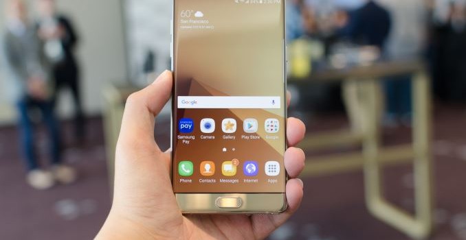
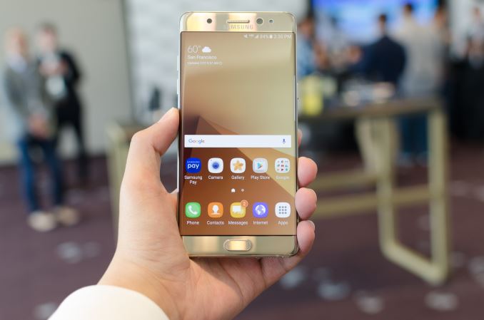
The Galaxy Note line is a staple at this point, a segment that Samsung truly owns as the first mover and has been wildly successful in ways that Samsung really didn’t predict. The Galaxy Note line has often been said to be the true flagship of the Galaxy smartphone family, and to some extent that probably isn’t far off the mark. With the Galaxy Note7, Samsung is seeking to better indicate that status by bringing it up to the same generation as the Galaxy S7.

Of course, the number is just part of a name, so to see whether the Galaxy Note7 lives up to its promise as the flagship of the Galaxy line we can start with some basic specs.

  Samsung Galaxy Note5 Samsung Galaxy Note7
SoC Exynos 7420
4x Cortex-A57 @ 2.1Ghz
4x Cortex-A53 @ 1.5GHz
Mali T770MP8

(Samsung 14LPE)

Snapdragon 820 (US)
2x Kryo @ 2.15GHz
2x Kryo @ 1.6GHz
Adreno 530

Exynos 8890 (ROW)
4x Exynos M1 @ 2.3GHz
4x Cortex A53 @ 1.6GHz
Mali T880MP12

(Samsung 14LPP)

RAM 4GB LPDDR4 4GB LPDDR4
NAND 32/64/128GB NAND (UFS 2.0) 64GB NAND (UFS 2.0) + microSD
Display 5.7” 1440p
SAMOLED
5.7” 1440p
SAMOLED Dual Edge
Network 2G / 3G / 4G LTE (Category 6/9 LTE)
Region Dependent
2G / 3G / 4G LTE (Category 12/10/9 LTE)
Region Dependent
Dimensions 153.2 x 76.1 x 7.6mm, 171g 153.5 x 73.9 x 7.9mm, 169g
Camera 16MP Rear Facing w/ OIS f/1.9, 1.12µm, 1/2.6″
(Sony IMX240, Samsung S5K2P2)
12MP Rear Facing w/ OIS, f/1.7, 1.4µm, 1/2.6″
(Sony IMX260, Samsung S5K2L1)
5MP Front Facing, f/1.9, 1.12µm
(Samsung S5K4E6)
5MP Front Facing, f/1.7, 1.12µm
(Samsung S5K4E6)
Battery 3000 mAh (11.55 Whr) 3500 mAh (13.48 Whr)
OS Android 5 w/ TouchWiz
(At Launch)
Android 6 w/ TouchWiz
(At Launch)
Connectivity 2×2 802.11a/b/g/n/ac,
BT 4.2
microUSB, USB2.0,
GPS/GLONASS/Beidou
NFC, MST
2×2 802.11a/b/g/n/ac,
BT 4.2
USB-C, USB?,
GPS/GLONASS/Beidou
NFC, MST
Fingerprint Sensor Capacitive by Synaptics Capacitive by Synaptics
SIM NanoSIM NanoSIM

At a high level, there’s really not a lot that changes relative to the Galaxy S7 family. The same Exynos 8890 and Snapdragon 820 SoCs are used in the same regions as the Galaxy S7. The cameras are the same as well. Really, it’s easier to talk about what sets the Galaxy Note7 apart than the similarities as there is a lot of common ground here. Relative to the Galaxy S7 edge, the Note7 gains the S-Pen, a slightly larger 5.7 inch dual-edge display, and has a slightly smaller 13.48 WHr battery. The Note7 also gains a USB type C port.

While it may be easy to get caught up on the slightly reduced battery capacity of the Note7 relative to the S7 edge, realistically the delta is solely due to the addition of the S-Pen. The camera hump is basically already nonexistent on these phones, so I’m not sure it necessarily makes a lot of sense to make the battery even larger when the cost will likely come in the form of a larger phone overall. Based on Samsung’s consumer research, one of the single biggest requests from users was to fit the biggest possible display into the smallest possible phone, so jumping up to something like 15 WHr would likely compromise that goal.

In a lot of ways, the Galaxy Note7 attempts to try and refine the Galaxy S7 edge, and one of the notable ways that Samsung has done this is refining the design. Samsung emphasized the amount of symmetry present in this design, and almost everything is aligned in this phone unlike the Galaxy S7. The Galaxy S7 felt like it wasn’t all that cohesive in general with things like the USB port misaligned with the speaker port and 3.5mm headphone jack, so this is actually a notable difference although I’m not sure this would really make a sale one way or another.

The more obvious way that design has been emphasized with the Galaxy Note7 is the total lack of a flat display variant, which was done in an effort to respond to the demand to make the device smaller. There’s really no doubt that the Galaxy Note7 is a smaller phone now as the width of the phone has been reduced by 3mm relative to the Galaxy Note5, and is almost identical in other dimensions and weight. That’s basically as far as the functional aspect of the edge display goes, and Samsung was fairly clear in their messaging that the edge display is just aesthetically better. They’re definitely not wrong here, but if you like using screen protectors the only way to cover the display will be with wet-application TPU-based protectors. Of course, Gorilla Glass 5 is on the front to help reduce the likelihood of damage but given that scratch resistance against ubiquitous quartz sand is still not going to be amazing you’ll still want a screen protector if microscratches bother you.

By using the edge display and 3D curved glass on the back, the design of the Galaxy Note7 is notably symmetrical when you look at its side profile, which is actually a pretty neat effect. For whatever reason the display of the Galaxy Note7 doesn’t have the normal green tint at the edges that I’ve come to expect from the S7 edge. According to Samsung the curvature has been adjusted somewhat relative to the Galaxy S7 edge which is what results in the difference in viewing angles. The display is otherwise identical in terms of performance and efficiency, with the sole exception of a new HDR display mode that allows maximum brightness to go as high as 600 nits in high APL conditions for short periods of time. This is contrasted with the outdoor brightness boost function which is closer to 500 nits. Based on conversations with those at Samsung it seems that this mode can only be unlocked by a few specific applications like Amazon’s Prime Video app, but I’m sure that with enough digging around in the system it will be possible to figure out the API that allows for controlling this functionality for third party HDR video playback.

Continuing with the design theme, the software of the Note7 has seen major revisions with a new version of TouchWiz that looks to incorporate better iconography and better overall design. Of course, it’s hard to say whether the device has been made smoother or faster here, but that’s something best left to the full review. There are also some notable new software features like a secure folder that uses Knox’s secure container APIs to allow photos, notes, and other app information to be stored separately with fingerprint or iris authentication.

While we’re still on the subject, it’s worth mentioning that Samsung has added iris authentication on the Note7 which is probably not a surprise if you follow any of this closely. It seems to work well and uses IR light to make sure it works in low light but it’s important to note that this system has a somewhat low preview frame rate and can only use one set of eyes for registration. It also notes a number of limitations in the UI but doesn’t actually require you to take off your glasses or contacts even though it suggests these things in the UI. The iris scanner also works at about 10-14 inches away from the eye which is kind of surprising and leads me to believe that this may be closer to some advanced facial recognition with a wide and narrow angle lens to capture the face and eyes rather than true iris scanning.
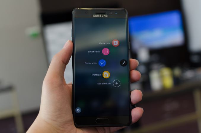
The other new software feature added is the ability to turn videos into GIFs with the S-Pen. Samsung representatives noted that this only works with non-DRM video, so I’m guessing that YouTube won’t necessarily work 100% of the time here although capturing videos taken by the camera definitely will. There’s also the ability to dynamically translate text selected by the S-Pen and take notes with the Always-On Display feature. Samsung has also wisely combined the mishmash of note-taking applications with the previous generations of Galaxy Note phablets and replaced them with a single Samsung Notes application to improve user experience.

On the hardware side, the S-Pen has been redesigned so that the phone is not damaged if you decide the stick the S-Pen in backwards for whatever reason, and a smaller 0.7mm tip with double the pressure sensitivity of the Note5. The device is still fully IP68 compliant whether the S-Pen is attached or detached, so you can theoretically take notes with the phone in a bathtub or something similar. As the S-Pen uses licensed Wacom magnetic resonance technology, it maintains full accuracy and sensitivity in the presence of water unlike partially capacitive solutions like the Apple Pencil.

Outside of the device itself, Samsung is including new accessories like an IP68 compliant wireless charging battery case, and an S View standing cover that makes it easy to prop up the device when it’s on a desk as Samsung noticed in their user studies that people often wanted to watch content without holding the device, with various implements used to achieve that goal.

If you want the Galaxy S7 edge with an S-Pen, the Galaxy Note7 looks to be that and a bit more as far as software and overall design goes. It’ll be important to see how it does in the review but honestly given Samsung’s track record I would be surprised to discover anything out of the ordinary with the Note7.

The Galaxy Note7 will be available in Blue Onyx, Silver Titanium, and Black Onyx in the US on AT&T, Sprint, T-Mobile USA, US Cellular, and Verizon in stores starting August 19 and preorders starting on August 3. An updated companion Gear VR with USB-C support and a slightly wider 101 degree FOV along with a dark blue design will also be available with the same dates for preorder and general release.