Hands On With the Samsung Galaxy Note8: Think Big
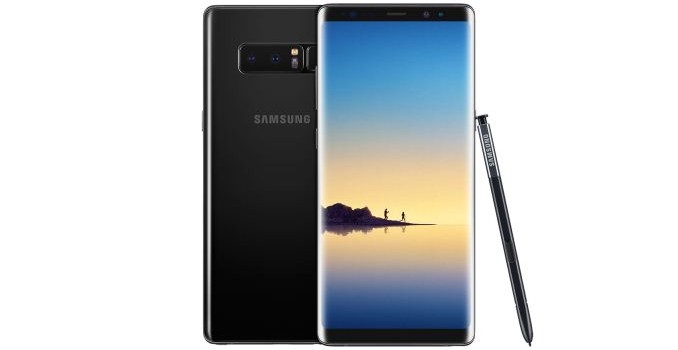
At the aptly named Unpacked event, this morning Samsung is taking the wraps off of their next generation phablet, the Galaxy Note8. A staple of summer handset launches, the Note has become the third pillar of Samsung’s flagship Galaxy device lineup, and for various reasons – good and bad – is perhaps the most memorable and unique member of the Galaxy family. While other Android handset vendors can give Samsung a run for their money in the smartphone space, Samsung has carved out and held on to the very distinct niche of the modern, stylus-equipped phablet.
Over the years the company has continued to refine their flagship phones and phablets, and in the last couple of years in particular this has culminated in the Galaxy Note becoming the de-facto third member of the Galaxy S family. While it shows up a few months later than its original, stylus-free counterparts, it has increasingly followed the basic design cues of the Galaxy S family, not to mention the underlying hardware platform. The Galaxy Note8, in turn, is no different. As we’ve seen in our hands-on, it’s more than just a Galaxy S8 with a stylus, but that’s certainly where Samsung started, and the single best frame of reference for understanding the device.
So what sets the Note8 apart from the Galaxy S series, and arguably makes it the flagship of all Samsung phones? Phablet size and the traditional Galaxy Note stylus & software aside, the marquee feature for this generation of the Note is the camera system. Samsung has taken the already very capable Galaxy S8’s camera system and doubled down, making the jump to a dual camera system. Samsung is far from the first vendor to do this – for better or worse, dual cameras in some form have become a checkbox feature for 2017 – however in lieu of being first they’re looking to be the best. And that means equipping the phone with full-featured, high quality camera modules for both the standard telephoto and new wide-angle cameras.
| Samsung Galaxy Family | |||
| Samsung Galaxy Note8 | Samsung Galaxy S8+ | Samsung Galaxy Note7 | |
| SoC | Qualcomm Snapdragon 835 (US, China, Japan) 4x Kryo 280 Performance @ 2.35GHz 4x Kryo 280 Efficiency @ 1.90GHz Adreno 540 Samsung Exynos 8895 (Rest of World) |
Snapdragon 820 (US) 2x Kryo @ 2.15GHz 2x Kryo @ 1.6GHz Adreno 530 Exynos 8890 (ROW) |
|
| Display | 6.3-inch 2960×1440 (18.5:9) SAMOLED (curved edges) |
6.2-inch 2960×1440 (18.5:9) SAMOLED (curved edges) |
5.7-inch 2560×1440 (16:9) SAMOLED Dual Edge |
| Dimensions | 162.5 x 74.8 x 8.6 mm 195g |
159.5 x 73.4 x 8.1 mm 173g |
153.5 x 73.9 x 7.9mm 169g |
| RAM | 6GB LPDDR4 | 4GB LPDDR4 | 4GB LPDDR4 |
| NAND | 64GB (UFS) + microSD |
||
| Battery | 3300 mAh non-replaceable |
3500 mAh (13.48 Wh) non-replaceable |
3500 mAh (13.48 Wh) non-replaceable |
| Front Camera | 8MP, f/1.7 | 5MP, f/1.7, 1.12µm | |
| Rear Cameras | Wide-Angle: 12MP, f/1.7, dual-pixel PDAF, OIS, auto HDR, LED flash | 12MP, 1.4µm pixels, f/1.7, dual-pixel PDAF, OIS, auto HDR, LED flash | 12MP Rear Facing w/ OIS, f/1.7, 1.4µm, 1/2.6″ |
| Telephoto: 12MP, f/2.4, OIS | |||
| Modem | Snapdragon X16 LTE (Integrated) 2G / 3G / 4G LTE (Category 16/13) Samsung LTE (Integrated) |
2G / 3G / 4G LTE (Category 12/10/9 LTE) Region Dependent |
|
| SIM Size | NanoSIM | ||
| Wireless | 802.11a/b/g/n/ac 2×2 MU-MIMO, BT 5.0 LE, NFC, GPS/Glonass/Galileo/BDS | ||
| Connectivity | USB Type-C, 3.5mm headset | ||
| Features | fingerprint sensor, heart-rate sensor, iris scanner, face unlock, fast charging (Qualcomm QC 2.0 or Adaptive Fast Charging), wireless charging (WPC & PMA), IP68, Mobile HDR Premium | ||
| Launch OS | Android 7.1.1 w/ TouchWiz | Android 7.0 w/ TouchWiz | Android 6 w/ TouchWiz |
But before we get too deep down the camera hole, let’s take a look at the basic specifications of the phone. As has become tradition for Samsung, the basic hardware of the Galaxy Note8 is practically lifted from this year’s Galaxy S8 series. This means that North America and some other CMDA territories will be receiving phablets powered by Qualcomm’s Snapdragon 835, and the rest of the world will be receiving phones based on Samsung’s own Exynos 8895. Both models, are in turn paired with 6GB of LPDDR4 RAM, 2GB more than the Galaxy S8 phones.
Interestingly, the stars have aligned such that both SoCs are being fabbed by Samsung on their 10nm LPE process, and even under the hood the SoCs aren’t too dissimilar, employing an octa-core setup with 4 high-performance cores and another 4 high-efficiency cores. Though for our readers in territories receiving the SD835 version, you’re likely in luck – our extensive testing on the two SoCs last month found that while both SoCs are quite capable, the Snapdragon 835 is the faster of the two – a pattern I’d expect to hold with the Galaxy Note8.
Samsung’s flagship phablet also inherits the S8’s SAMOLED Infinity display, however its size and shape have been altered to fit the needs of the Note8’s body. For their latest phone Samsung is enlarging their screen yet again; whereas the Note7 shipped with a 5.7-inch display and the Galaxy S8+ with a 6.2-inch display, the Note8 pushes that to 6.3-inches, making this Samsung’s largest phone display to date. In terms of specifications, the display is functionally identical to the S8+, utilizing a wider-than-usual 2960×1440 (Quad HD+) PenTile SAMOLED display. Making full use of the flexibility of OLED panels, Samsung has also retained their Infinity curvature. However unlike the S8 phones, Samsung has squared off the Note8 to maximize the amount of writing surface; the display is now flat to the edge of the phone, where it then more sharply curves to the sides, rather than having the S8’s gradual curve over more of the phone. In some respects it’s closer to the older Dual Edge design than it is the Infinity design.
The net effect of this change is that the Note8 holds more like a larger Note7 than it does an S8+, a fitting choice given the use of a stylus. In my brief time with the phone, I found that it feels easier to hold than the S8+, though this is of course highly variable with hand size and what you’re used to as far as phone designs go. Otherwise, the full dimensions of the phone mirror the larger screen, making this Samsung’s largest phone yet, measuring 162.5 x 74.8 x 8.6 mm, quite a bit taller, a smidge wider, and definitely thicker than either the previous Note7 or the S8+.
Samsung of course was rather aggressive on size for the Galaxy Note7, and a lack of space for the high capacity battery was a contributing factor in the battery issues that ultimately lead to the recall of that device. Exploding phone jokes aside, this brings up a serious point for Samsung, which is how they recover from the Note7 fiasco. Arguably the first part of that process was successfully rolling out the Galaxy S8 family, to show the public that they haven’t lost their touch overall. However as the successor to the Note7, the launch of the Note8 brings the subject back to the forefront of the public mind, and what Samsung is doing to make sure the Galaxy Note8 doesn’t go out with a bang.
The biggest change here is the sheer amount of validation the phone has gone through. Instituted earlier this year – and being carried through with the Note8 – is Samsung’s “8-point Battery Safe Check” process, to validate the design and manufacturing of the Note8’s battery. Equally (if not more) significant is that rather than go it alone, Samsung has retained the services of UL – whom helped with the original Note7 root cause analysis – to check and certify the Note8 battery design.
Even then, in terms of total battery capacity, the Note8 is smaller than both the Note7 and the S8+. Both of those phones shipped with a 3500 mAh battery, whereas the Note8 uses a slightly smaller 3300 mAh battery, despite the phone’s overall larger size. Ultimately only time can judge how well Samsung has done here, but the company does not seem to be taking any chances. The one silver lining for the company is that despite their missteps with the Note7, consumer adoption of competing stylus-equipped phablets has been tepid, so while the Note7’s problems cost Samsung a lot of money in the short-term, in the long-run it looks like Samsung is in position to retain their control of the market.
Moving on, let’s talk about the Note8’s defining feature: the S-Pen stylus. For the Note8 the company hasn’t radically altered the stylus or its functionality – retaining the 0.7mm tip and 4096 levels of pressure sensitivity – however there have been some small changes. Overall the pressure sensitivity curve of the phablet and stylus duo has been altered to increase their sensitivity, as Samsung is going for what they’re calling a “more natural” writing experience. Otherwise Samsung has also retained the complete IP68 water proofing for the phone and stylus, including when the stylus is removed.
For the Note8 the company is rolling out some new software features to take advantage of the stylus. Of particular note (ed: no pun intended), the company is rolling out a new feature they call Live Message, which is an add-on for chat applications that lets a user write out a message with the stylus, and then have it sent as an animated GIF so that the recipient can see the (delayed) drawing process in action. Samsung has also tweaked the Note’s longstanding screen off memo feature, increasing the number of memo pages to 100, while there’s also better integration between the stylus and the phone’s language translation features.
Overall the stylus remains the single most important feature of the Note series, however for the S8/Note8 generation in particular, Samsung’s camera choice will give the stylus a run for its money. As I mentioned earlier, the Note8 is the first high-end Samsung phone to ship with dual rear cameras, following the same general trend as other smartphone vendors over this generation. However unlike much of Samsung’s competition, the company is looking to one-up the early adopters by doing dual cameras better than anyone else, including Apple.
To do that, the company is doubling down on the already impressive 12MP Galaxy S8 camera by giving the Note8 a pair of those camera. The first camera is the traditional wide-angle camera, and features the same 12MP, f/1.7 dual-pixel PDAF with OIS camera as the Galaxy S8. Meanwhile the second camera gets a telephoto lens with an effective 2x magnification, while the underlying hardware is slightly different. The sensor is still 12MP and loses the dual-pixel PDAF, however it does retain OIS. This latter point is particularly interesting, as even front-runner Apple didn’t put OIS on the iPhone 7 Plus’s telephoto camera, giving Samsung a technical leg-up over their nearest competitor.
The difference is that this makes it possible to apply not only electronic image stabilization, but optical stabilization as well to anything captured with the telephoto camera, be it a zoom shot of a subject or a shot exploiting depth-of-field effects. The company even had a demo setup to show the difference, and while the scenario was without a doubt contrived – with phones mounted to a box specifically set to continually shake them – the effect was none the less impressive. For the unsteady-handed, OIS is often the savior of photos, so having OIS on both cameras has its advantages, especially as the optical zoom of the telephoto lens exacerbates any movements.
Otherwise, Samsung’s camera software will offer the usual features that we’ve come to see on dual-camera phones. This includes using the telephoto camera as a straight-up optical 2x magnification mode, and using it in conjunction with the wide-angle camera to augment the quality when magnifying between 1x and 2x. And of course, the ever-popular artificial bokeh depth-of-field effect will be available by taking advantage of the parallax between the two cameras. Since the effect is artificial, Samsung’s Live Focus feature even allows altering its intensity, both in preview mode and after a photo is taken.
Rounding out the package then is the usual suite of features you’d expect from a Galaxy Note phone. This includes NFC, 802.11ac WiFi, BT 5.0, a USB Type-C port, and 3.5mm headset jack. Coming from the Galaxy S8, the phone also includes Samsung’s iris sensor and associated phone unlocking capabilities. On the software side, the phone will ship with Android 7.1.1, a reasonable yet awkward choice since Google officially launched Android 8 Oreo earlier this week. At the same time, Samsung is offering monthly security updates, and while Samsung hasn’t discussed Android 8 yet, the Note8 is clearly going to be a high priority candidate for the new OS.
Pre-orders for the Galaxy Note8 will start tomorrow, and carriers will begin stocking it in stores on September 15th. Of particular note here, Samsung is also going to be selling the carrier-unlocked version right out of the gate from their own site, so for customers looking to avoid going through the carriers, it won’t be necessary to wait for the unlocked version. Both the carrier and unlocked versions will come in Orchid Grey and Midnight Black, while the global versions will also include the Maple Gold and Deep Sea Blue colors.
As of press time, Samsung has not announced the price of the phone, though like past Note phones, don’t expect this one to be cheap. Samsung has announced that the unlocked version of the phone will be priced at $929. To sweeten the deal for the next month, Samsung will be running a bundle deal that will offer either a Gear 360 camera or a Galaxy Foundation Kit (128B EVO+ memory card + a fast wireless charger) with the phone.

