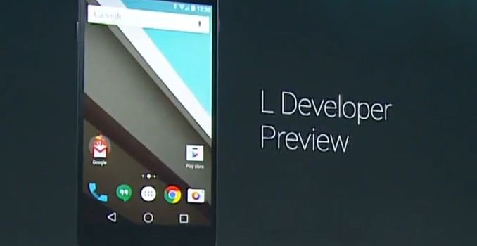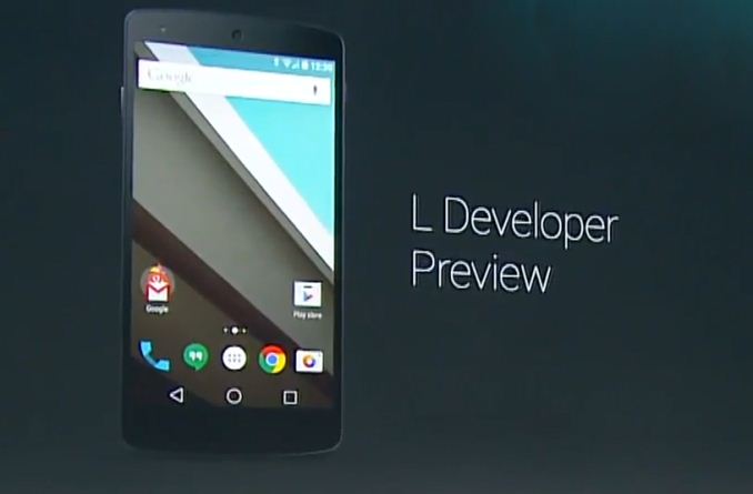
Today at Google I/O many of Google’s designers and engineers took to the stage to give the world a few previews of the new design and features that will be included in the yet to be named upcoming Android L release. The most visible of all the changes comes with Google’s new design language and so that’s something to talk about first before focusing on the changes under the hood.
Google’s New Design Language

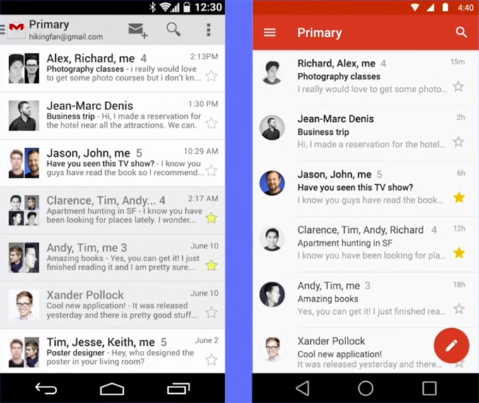
Google’s new design language is something they call Material Design. Material design is something Android users are already familiar with from the design of Google Now and some of the recently updated Android applications like Google I/O 2014. Material design takes inspiration from physical materials like paper and ink, but implements these concepts in a modern way that is very different from other designs like the skeuomorphic interface of old versions of operating systems like iOS. In the upcoming Android L release the entire interface will be redesigned using this new type of design language. To demonstrate it, Google’s Director of Android User Experience Matias Duarte demonstrated the upcoming changes to the Gmail application after being redesigned using these new principles of Material Design.

As you can see, the app adopts a much cleaner and more colorful appearance while still being completely familiar to users acquainted with the older application. The use of lines in the application has been reduced with the lines that separate emails being thinner and extending only across a portion of the screen, and the border from the star on favorited emails being removed entirely. The contact icons adopt a circular design similar to what Apple has done with iOS 7, and a circular bubble for starting a new email is ever-present at the bottom of the display. One final thing to note is the retirement of the three dot overflow menu in favor of moving settings and navigation into the pane that slides in from the left side of the display.
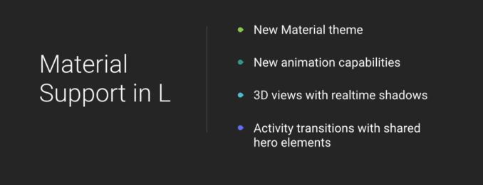
Another significant part of the new design language which is hard to describe in photos and words is the use of depth, shadows, and animations. Google has really worked hard on creating an interface that feels responsive and resonates with how humans interact with devices. In Android L every interface element can have a Z-axis level specified and this will change how the application looks by altering 3D views and adding lighting and shadows that will be different in size and scale based on what position an element is on the 3D plane.
Google’s new Material Design principles are something they hope developers will use to create unified applications across all of their platforms, extending far beyond Android. Some more info about the fundemental principles of Material Design can be found in this guidebook.
Improved Notifications and Recent Applications
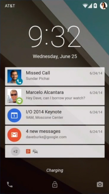
In Android L Google is making significant improvements to how notifications are handled on Android. A feature that is often requested is lockscreen notifications and in Android L Google is displaying notifications right on the lockscreen of a device.

As you can see, each application can display a card on the lockscreen to notify the user of anything they missed. Multiple notifications from the same app are consolidated into one card to make effective use of space. By swiping down the user reveals other cards that are further down in the list of notifications. Touching a card brings the user to the application the notification was for, and swiping cards to the right removes them in the same fashion as swiping away banners in the normal notification center.

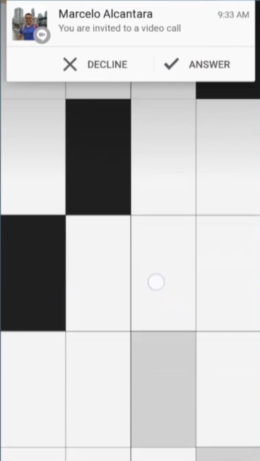
Google has also improved how notifications work within applications. In a similar fashion to the new notifications shown in the iOS 8 preview. Android notifications can now present the user with banners that appear at the top of the display with relevant options for responding to them. During the keynote Google demonstrated how a user can recieve a video call while playing a game and they can choose to either decline and continue playing or answer and be taken to the application the notification was sent from.
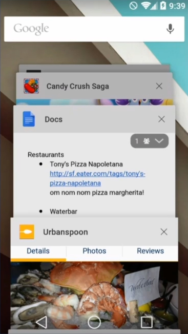
Android L will also bring along big changes to the recent apps list. Currently the recent apps list consists of a single card for each application that the user has recently opened. In Android L applications will now be able to display multiple cards in the recent apps list to make it easier for the user to navigate and to create a more complete history of where the user has recently been on their device.

As you can see above, the recent apps list uses the new principles of Material Design. Each application is presented as a card in a scrolling list with realistic lighting and shadows that reacts to the position of the cards in the list. One very important thing to mention about the new functionality about the recent apps list is that it includes cards for each browser tab that the user has open, rather than just consolidating them all to a single card for whatever web browser the user uses. With this Google is making a statement about how they feel about web applications and how they should be treated similarly to native apps on the device. It is a very different approach from what Apple and Microsoft are doing but with Google’s far reaching web services it makes sense to handle web applications this way. It may also reduce the number of apps created that are simply mobile websites wrapped in an application which is good for all users.
Improvements Under the Hood

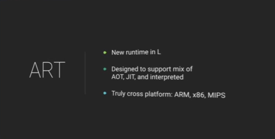
Android L brings along some major improvements to the underlying OS along with all the changes on the surface. One of the most significant for developers and users alike is the retirement of Google’s Dalvik virtual machine. Dalvik has been the software that runs Android applications since the beginnings of Android itself and with Android L Google is removing it entirely in favor of their new ART runtime. While Dalvik uses mainly Just-in-Time code compilation to compile Java bytecode into machine code at the time it is run, ART opts for Ahead-of-Time compilation which compiles Java bytecode into machine code at the time of install. Because of this, applications do take up slightly more space and take longer to install, but there should be significant performance improvements with this new Android runtime. During the keynote Google noted that benchmarks running on ART can see up to 4x the performance over the same benchmark being run in Dalvik. Google also made a point of noting that ART is very cross platform with support for x86, ARM, and MIPS instruction sets.

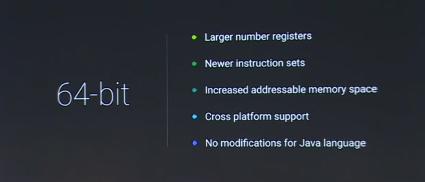
The next big announcement is 64-bit Android support. Apple launched the first 64bit mobile devices with iOS 7 and the Apple A7 CPU in late 2013 and a 64-bit version of Android has been long awaited ever since then. Android L includes complete support for 64-bit with all instruction sets that Android supports including ARMv8, x86-64, and MIPS64. With this comes support for larger numbers of registers, and an increase in the addressable amount of memory which will come in handy in the near future if the amount of RAM in Android devices continues to increase at the rate it currently is.
Improved Tools for Improving Battery Life

Battery life is always a concern with mobile devices that are running increasingly more powerful hardware and complicated software. In Android L Google has been working on what they call Project Volta. Project Volta is an effort to improve the battery life on Android smartphones through software optimization. Volta has a part aimed at developers and a part aimed at users. The part aimed at developers starts with a new tool that Google has created called Battery Historian.

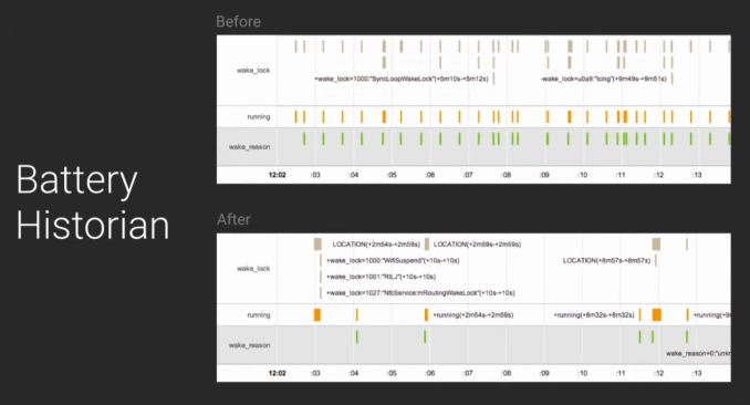
Battery Historian is a tool that allows the user to see how the battery is being used on their device and at what times certain hardware features or processes are using the battery. This is mainly aimed at developers to help them improve when their application performs things like network requests which involves waking up the device’s radio and using lots of power. In the image above you can see a sample scenario where an application is causing a device’s radio to wake up roughly every twenty seconds. Developers can use this information to better schedule when their application should perform updates and grab information from the internet.
Google is also including a JobScheduler API for developers which allows them to perform specific tasks in their application during certain circumstances. An example would be only checking for updates when the device is connected to WiFi rather than doing it over cellular. The JobScheduler API can also have an application check for updates and new information at the same time as other applications to reduce the number of times a device has to wake up the radio and perform network tasks.

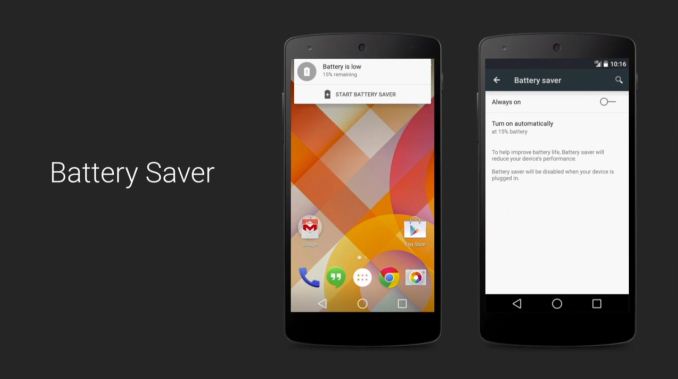
For users Google is including a feature that we’ve seen many OEMs implement on recent smartphones. Battery Saver is a feature that can reduce the performance of a device and limit the functionality of it to extend the battery life of a device when its battery has dropped below 20%. When the user’s battery is low the system will send a notification that allows the user to quickly enable the feature. It is not entirely clear to what extent the new battery saver feature limits the performance and capabilities of the device.
All these features are just a preview of what Google is doing in the upcoming Android L release. Google has not given a timeframe on when Android L will begin to ship but it’s clear that Google is very serious about creating a unified experience across all devices for all users and that Android has become their vessel to do so.

