Smartphones


A Look at Bioshock for iOS and How it Compares to its PC Counterpart

A Look at Bioshock for iOS and How it Compares to its PC Counterpart

I originally bought Bioshock for PC a number of years ago during one of Steam’s summer sales. It was $2, and I had heard good things about it so I decided to buy it. Unfortunately like many of the inexpensive purchases I made, the game sat in my library unplayed for a long period of time. A couple of years after purchasing it, a friend of mine mentioned that I had quite a number of unplayed games in my Steam library and insisted that I play some of them. At that time I finally sat down and played Bioshock, and it became one of my favorite first person shooter games of all time. While some of the visuals seemed dated as a result of me playing it so long after its release, the atmosphere, setting, environments, and the story were some of the best I had experienced in a video game.

When I recently heard that Bioshock would be coming to iOS, I felt both excitement and worry. The excitement was obviously due to my love of the game and the appealing prospect of being able to play it on a smartphone. The worry came from my fear that the game would be severely crippled to run on mobile devices. Deus Ex: The Fall was a recent disappointment for smartphone gaming based on a successful PC and console franchise, and I worried Bioshock would meet a similar fate. But I was hopeful that it would be a faithful experience so long as they maintained the original experience which wasn’t designed for the limitations of mobile hardware. Thankfully from my experience with the game so far, my hope wasn’t misplaced.

Getting Set Up

Bioshock was originally released in 2007, and includes support for DirectX 9 on Windows XP and DirectX 10 on Windows Vista. Windows 7 has never really been an officially supported operating system, and I find that Bioshock gives me more trouble than other games do. Just do a Google search for “Bioshock crash windows 7” and you’ll see what I mean. The issues seem to relate to audio, as on a new Windows install I will either have issues with crashes to desktop or a lack of audio in an otherwise functioning game. Disabling all sound output devices except for the one in use seemed to fix the issue this time.

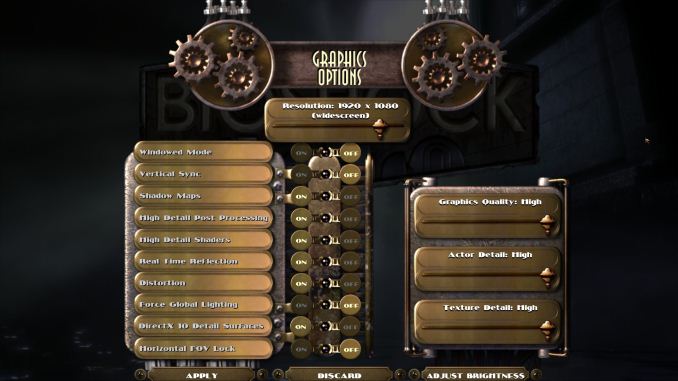
Once the game was booted I jumped into the graphics settings menu to make sure everything was at its highest setting. For the purposes of these comparisons the PC versions of the game was run at 1920×1080 for a 16:9 aspect ratio matching that of the iPhone 5s version.

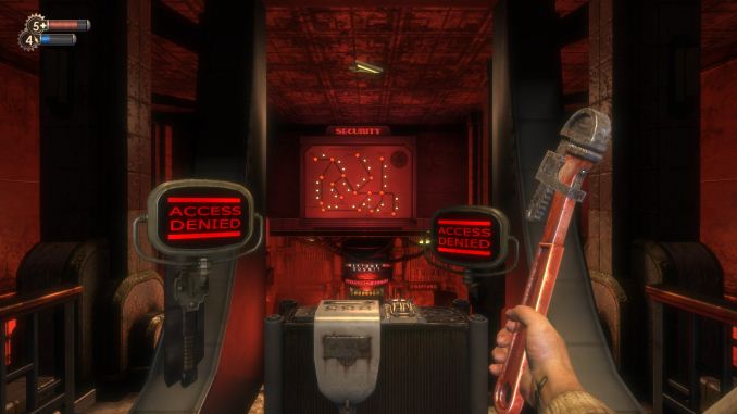
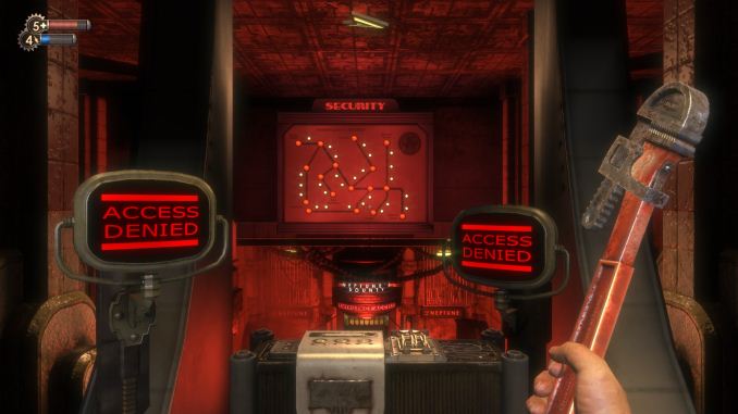
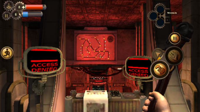
There’s one option here that needs to be discussed and that’s the option for “Horizontal FOV Lock.” Essentially this setting keeps the horizontal FOV at the same value it would be on a 4:3 display regardless of the aspect ratio of the monitor being used. For 16:9 displays this means a more zoomed in appearance. Below I’ve put screenshots of the game with this option on and off, as well as the iPhone version for reference.

Top: FOV lock off. Middle: FOV lock on. Bottom: iPhone version

The iOS version of the game doesn’t have any sort of graphical settings menu. As you can see above, it definitely uses the horizontal FOV lock setting and the field of view is essentially the same as on a PC or console with the setting enabled. At the very least, this ensures a consistent experience going from iPhone to iPad, but I’m still not a fan of how zoomed in it feels at times.

Bioshock on iOS doesn’t really require any setup like the PC version. There are settings for difficulty, subtitles, object highlight, the quest arrow, and vita chambers, but like other mobile games there’s nothing involving graphical settings. The menus themselves are the same as the PC version which really helps to make it feel like you’re playing the full Bioshock and not a cut down mobile experience.

Graphics

The first thing to talk about here is what devices Bioshock runs on. This is definitely the most demanding game on the App Store, and despite the visual concessions in bringing a PC game to mobile it still requires significant processing power. Because of that, only devices sporting Apple’s A6 or A7 chips can run the game properly. It will open on an older device but the frame rate is very low and the game becomes essentially unplayable. This means that every Apple A5 (and A5X in the third generation iPad) device is unsupported which is quite a long list of devices. First generation iPad Mini owners may be especially disappointed since their device is still sold and isn’t even two years old, but given that it launched with the same hardware platform as the iPad 2 from 2011 it was to be expected that it wouldn’t have a record setting length of time for software support. 

Top: PC. Bottom: Mobile

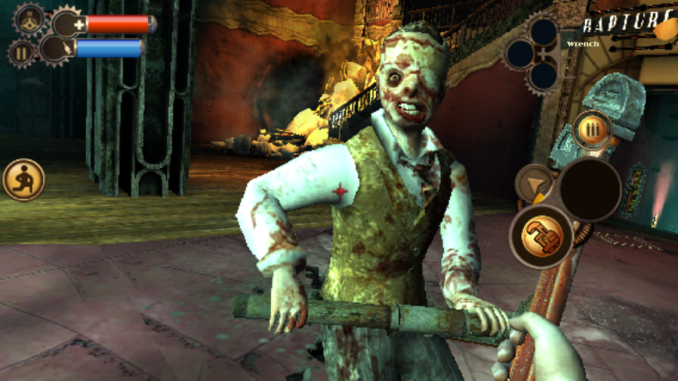
The game looks very impressive for a mobile shooter. Scenes like the introduction with the plane crash and the burning wreckage on the water have impressive fire and smoke effects that compare well to the PC version. However, there were definitely sacrifices made with the lighting and the shadows. The images for the HUD and the menus are also surprising low resolution, and I think the quality reduction there had more to do with fitting inside Apple’s 2GB limit for applications than any issue with hardware capabilities.

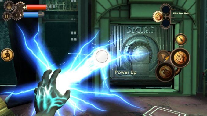
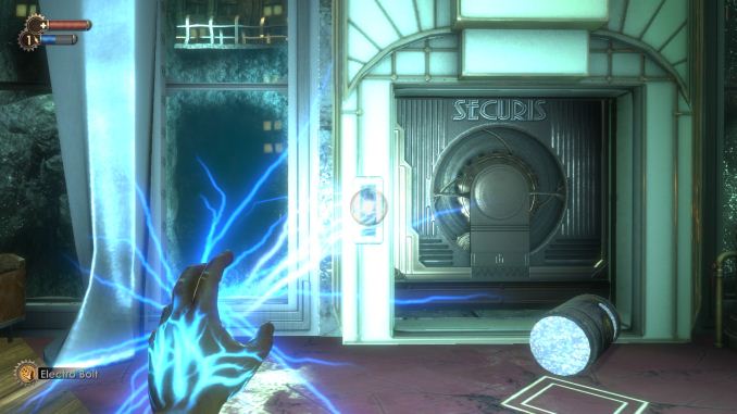
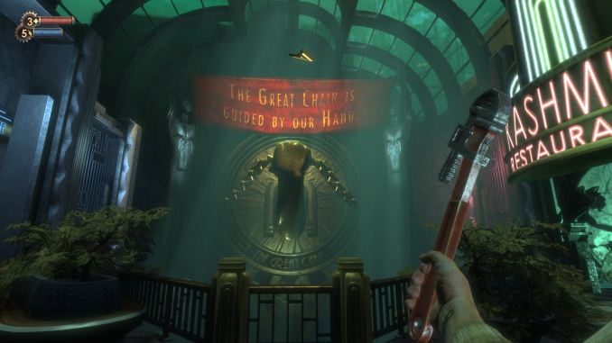
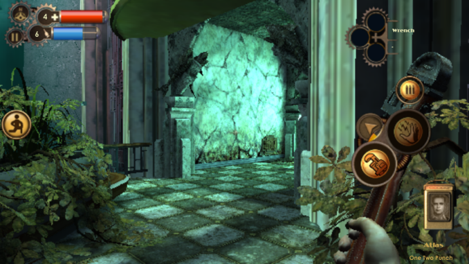
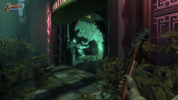
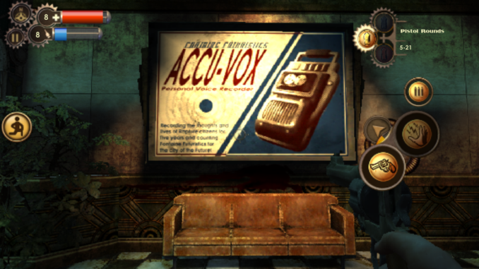
Below are some more comparisons of Bioshock on iOS compared to on PC. In all cases the mobile version is on the left and the PC version on the right. I’ve tried to take screenshots of several different areas and objects to give an idea of where the graphics were toned down to work on mobile, and where they really hold up well compared to the PC version. You can click the images to view in a larger size.

I feel like 2K did a good job in maintaining the quality of the models in the game when bringing it over to mobile. The effect for the electro bolt plasmid is really close to the PC version. Something that needs to be kept in mind is that some of the areas that look low quality in the iPhone screenshots are harder to notice when the game is in motion on a 4″ display.

I chose the last two comparisons for a reason, as they do well to demonstrate the affect that the reduced lighting and shadows have on the game’s atmosphere. Graphical fidelity aside, the game just isn’t as dark and creepy on mobile. The shadow of the splicer playing with the baby carriage being missing was especially disappointing as that’s a very disturbing scene and it doesn’t have the same impact without it.

The aliasing is also a significant issue as well. I don’t know what resolution the game has to render at to run at an acceptable frame rate but I think I would have taken some more graphical reductions for either anti-aliasing or a higher rendering resolution. My big concern is that the aliasing is really noticeable even on a 4″ iPhone 5s which has the best CPU and GPU speed relative to its resolution of all the devices the game runs on. While the iPad Mini Retina and iPad Air are less thermally constrained and can sustain higher clock speeds for a greater period of time, they’re likely to have even more issues with aliasing with the game being scaled up to larger displays. I also began to wonder about the overhead impact of OpenGL ES and if the game could look even better if it had been made to run using Apple’s Metal API that will be launching with iOS 8. I emailed 2K and they were unable to comment on any plans for using Metal on Bioshock or any future releases so we’ll have to wait and see how future iOS games can look with Metal.

Below I have an album of all the screenshots I took while playing. At the time of writing I was at the medical pavilion level and I do intend on completing the game on mobile. One final thing to note is that there’s no significant compression to the game’s audio to reduce the size. The audio contributes greatly to the atmosphere of Bioshock and I’m very happy it was preserved.

Gameplay

In my opinion the gameplay is really what matters. I would rather have a game that visually mediocre but enjoyable to play than one that looks amazing but feels like a glorified tech demo when played. I don’t have access to a Bluetooth controller so I’ll be evaluating the touch control experience for Bioshock on iOS. I believe that’s how most users will play the game anyway.

Before I talk about how the HUD functions, I really do need to reiterate that the blurriness of all the controls is distracting and annoying. I don’t know why they’re so low resolution and I really hope 2K updates the game to fix them.

Bioshock has a more complex control scheme than other first person shooters. This is partly due to the inclusion of plasmids which necessitates a way to switch between them and your weapons. Before the game released I had wondered if the game would be altered to allow plasmids and weapons to be used simultaneously like in Bioshock 2, but the original system has been preserved.

Movement is controlled by a virtual control pad on the left side which only appears when in use. Crouching and standing is controlled by the button on the left of the screen. On the right side of the screen there is a button with three bullets on it which is used for reloading weapons. When using plasmids the icon of this button changes to an eve hypo syringe. The section below the reload icon controls switching between weapons and firing. Tapping on the icon for the selected weapon or plasmid fires it. Tapping the other icon is how you switch between weapons and plasmids. When using a weapon or plasmid, the arrow icon cycles through them. This can be troublesome when trying to switch from the wrench to a weapon like the chemical thrower which requires several presses. Update: I’ve just been informed that holding the button brings up a quick menu with all weapons which is a very fast way to switch between them. The last menu section is the ammo selection menu at the top which allows you to cycle through the various ammo types for your weapon.

In practice these controls work fairly well as far as touch controls go, although I really want to try the game out using a Bluetooth game controller. The one control you may notice is missing is for jumping. Bioshock for iOS actually doesn’t have a way to jump, and some levels have had changes made as a result. For example, the very first level in the PC version has a fallen pillar on the ground and when approaching it the game tells you to hit the space bar to jump over it. Since the iOS version has no jumping, this tutorial and the fallen pillar was removed. While this does feel like a concession to make the game work on mobile, jumping was never a big part of Bioshock to begin with and when playing I never wanted to jump but was unable to.

One thing I would like to see is an update to allow the placement of the controls to be changed. The current position of the controls for firing and weapon switching end up covering the viewmodel for your weapon and I would like to move it further to the right side of the display.

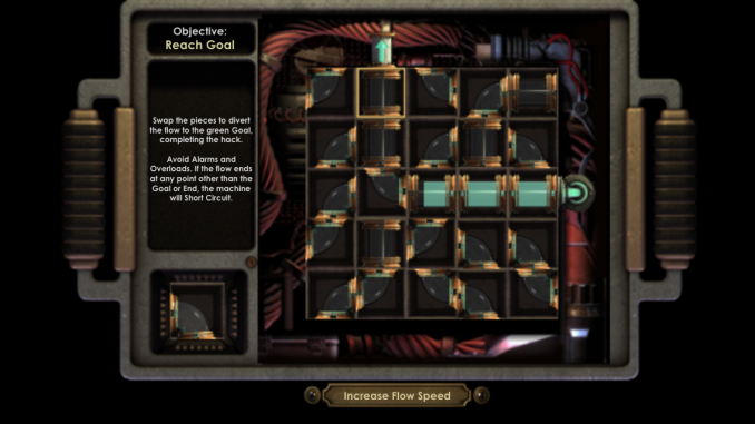
The rest of the gameplay is very faithfully brought over to mobile. Plasmids, hacking, upgrades, and everything else is still in the game. The hacking in particular translates very well to mobile, it may actually be better on mobile than it was on PC.

Conclusion and Thoughts on Handheld Gaming
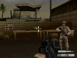
As I’m writing this I’m actually anxious to get back to playing because it’s very exciting to have a full fledged first person shooter game that can be put right in your pocket. When I was younger I remember that Call of Duty 4 for the Nintendo DS was the best you had for a handheld first person shooter and as you can see in the image on the right it’s not too impressive. We’ve come a long long way with what phones and handheld gaming devices can do. Although you often hear the term “console quality” thrown around regarding mobile GPU capabilities, I don’t think we’re quite there yet. But the gap between current generation smartphones and the previous generation of game consoles is certainly closing, and there’s nowhere for the quality of mobile games to go but up. I’m very excited to see what the future holds for mobile gaming.

Bioshock for iOS is available on the App Store now for $14.99. The download is 1.65GB in size (and takes up 2.6GB installed on my iPhone 5s) and it only runs on devices with Apple’s A6, A6X, or A7 chips which includes the iPhone 5, 5c, 5s, iPad 4, iPad Mini Retina, and iPad Air. I really think it’s worth checking out if you can spare the money and are a fan of the original game.


A Look at Bioshock for iOS and How it Compares to its PC Counterpart

A Look at Bioshock for iOS and How it Compares to its PC Counterpart

I originally bought Bioshock for PC a number of years ago during one of Steam’s summer sales. It was $2, and I had heard good things about it so I decided to buy it. Unfortunately like many of the inexpensive purchases I made, the game sat in my library unplayed for a long period of time. A couple of years after purchasing it, a friend of mine mentioned that I had quite a number of unplayed games in my Steam library and insisted that I play some of them. At that time I finally sat down and played Bioshock, and it became one of my favorite first person shooter games of all time. While some of the visuals seemed dated as a result of me playing it so long after its release, the atmosphere, setting, environments, and the story were some of the best I had experienced in a video game.

When I recently heard that Bioshock would be coming to iOS, I felt both excitement and worry. The excitement was obviously due to my love of the game and the appealing prospect of being able to play it on a smartphone. The worry came from my fear that the game would be severely crippled to run on mobile devices. Deus Ex: The Fall was a recent disappointment for smartphone gaming based on a successful PC and console franchise, and I worried Bioshock would meet a similar fate. But I was hopeful that it would be a faithful experience so long as they maintained the original experience which wasn’t designed for the limitations of mobile hardware. Thankfully from my experience with the game so far, my hope wasn’t misplaced.

Getting Set Up

Bioshock was originally released in 2007, and includes support for DirectX 9 on Windows XP and DirectX 10 on Windows Vista. Windows 7 has never really been an officially supported operating system, and I find that Bioshock gives me more trouble than other games do. Just do a Google search for “Bioshock crash windows 7” and you’ll see what I mean. The issues seem to relate to audio, as on a new Windows install I will either have issues with crashes to desktop or a lack of audio in an otherwise functioning game. Disabling all sound output devices except for the one in use seemed to fix the issue this time.

Once the game was booted I jumped into the graphics settings menu to make sure everything was at its highest setting. For the purposes of these comparisons the PC versions of the game was run at 1920×1080 for a 16:9 aspect ratio matching that of the iPhone 5s version.

There’s one option here that needs to be discussed and that’s the option for “Horizontal FOV Lock.” Essentially this setting keeps the horizontal FOV at the same value it would be on a 4:3 display regardless of the aspect ratio of the monitor being used. For 16:9 displays this means a more zoomed in appearance. Below I’ve put screenshots of the game with this option on and off, as well as the iPhone version for reference.

Top: FOV lock off. Middle: FOV lock on. Bottom: iPhone version

The iOS version of the game doesn’t have any sort of graphical settings menu. As you can see above, it definitely uses the horizontal FOV lock setting and the field of view is essentially the same as on a PC or console with the setting enabled. At the very least, this ensures a consistent experience going from iPhone to iPad, but I’m still not a fan of how zoomed in it feels at times.

Bioshock on iOS doesn’t really require any setup like the PC version. There are settings for difficulty, subtitles, object highlight, the quest arrow, and vita chambers, but like other mobile games there’s nothing involving graphical settings. The menus themselves are the same as the PC version which really helps to make it feel like you’re playing the full Bioshock and not a cut down mobile experience.

Graphics

The first thing to talk about here is what devices Bioshock runs on. This is definitely the most demanding game on the App Store, and despite the visual concessions in bringing a PC game to mobile it still requires significant processing power. Because of that, only devices sporting Apple’s A6 or A7 chips can run the game properly. It will open on an older device but the frame rate is very low and the game becomes essentially unplayable. This means that every Apple A5 (and A5X in the third generation iPad) device is unsupported which is quite a long list of devices. First generation iPad Mini owners may be especially disappointed since their device is still sold and isn’t even two years old, but given that it launched with the same hardware platform as the iPad 2 from 2011 it was to be expected that it wouldn’t have a record setting length of time for software support. 

Top: PC. Bottom: Mobile

The game looks very impressive for a mobile shooter. Scenes like the introduction with the plane crash and the burning wreckage on the water have impressive fire and smoke effects that compare well to the PC version. However, there were definitely sacrifices made with the lighting and the shadows. The images for the HUD and the menus are also surprising low resolution, and I think the quality reduction there had more to do with fitting inside Apple’s 2GB limit for applications than any issue with hardware capabilities.

Below are some more comparisons of Bioshock on iOS compared to on PC. In all cases the mobile version is on the left and the PC version on the right. I’ve tried to take screenshots of several different areas and objects to give an idea of where the graphics were toned down to work on mobile, and where they really hold up well compared to the PC version. You can click the images to view in a larger size.

I feel like 2K did a good job in maintaining the quality of the models in the game when bringing it over to mobile. The effect for the electro bolt plasmid is really close to the PC version. Something that needs to be kept in mind is that some of the areas that look low quality in the iPhone screenshots are harder to notice when the game is in motion on a 4″ display.

I chose the last two comparisons for a reason, as they do well to demonstrate the affect that the reduced lighting and shadows have on the game’s atmosphere. Graphical fidelity aside, the game just isn’t as dark and creepy on mobile. The shadow of the splicer playing with the baby carriage being missing was especially disappointing as that’s a very disturbing scene and it doesn’t have the same impact without it.

The aliasing is also a significant issue as well. I don’t know what resolution the game has to render at to run at an acceptable frame rate but I think I would have taken some more graphical reductions for either anti-aliasing or a higher rendering resolution. My big concern is that the aliasing is really noticeable even on a 4″ iPhone 5s which has the best CPU and GPU speed relative to its resolution of all the devices the game runs on. While the iPad Mini Retina and iPad Air are less thermally constrained and can sustain higher clock speeds for a greater period of time, they’re likely to have even more issues with aliasing with the game being scaled up to larger displays. I also began to wonder about the overhead impact of OpenGL ES and if the game could look even better if it had been made to run using Apple’s Metal API that will be launching with iOS 8. I emailed 2K and they were unable to comment on any plans for using Metal on Bioshock or any future releases so we’ll have to wait and see how future iOS games can look with Metal.

Below I have an album of all the screenshots I took while playing. At the time of writing I was at the medical pavilion level and I do intend on completing the game on mobile. One final thing to note is that there’s no significant compression to the game’s audio to reduce the size. The audio contributes greatly to the atmosphere of Bioshock and I’m very happy it was preserved.

Gameplay

In my opinion the gameplay is really what matters. I would rather have a game that visually mediocre but enjoyable to play than one that looks amazing but feels like a glorified tech demo when played. I don’t have access to a Bluetooth controller so I’ll be evaluating the touch control experience for Bioshock on iOS. I believe that’s how most users will play the game anyway.

Before I talk about how the HUD functions, I really do need to reiterate that the blurriness of all the controls is distracting and annoying. I don’t know why they’re so low resolution and I really hope 2K updates the game to fix them.

Bioshock has a more complex control scheme than other first person shooters. This is partly due to the inclusion of plasmids which necessitates a way to switch between them and your weapons. Before the game released I had wondered if the game would be altered to allow plasmids and weapons to be used simultaneously like in Bioshock 2, but the original system has been preserved.

Movement is controlled by a virtual control pad on the left side which only appears when in use. Crouching and standing is controlled by the button on the left of the screen. On the right side of the screen there is a button with three bullets on it which is used for reloading weapons. When using plasmids the icon of this button changes to an eve hypo syringe. The section below the reload icon controls switching between weapons and firing. Tapping on the icon for the selected weapon or plasmid fires it. Tapping the other icon is how you switch between weapons and plasmids. When using a weapon or plasmid, the arrow icon cycles through them. This can be troublesome when trying to switch from the wrench to a weapon like the chemical thrower which requires several presses. Update: I’ve just been informed that holding the button brings up a quick menu with all weapons which is a very fast way to switch between them. The last menu section is the ammo selection menu at the top which allows you to cycle through the various ammo types for your weapon.

In practice these controls work fairly well as far as touch controls go, although I really want to try the game out using a Bluetooth game controller. The one control you may notice is missing is for jumping. Bioshock for iOS actually doesn’t have a way to jump, and some levels have had changes made as a result. For example, the very first level in the PC version has a fallen pillar on the ground and when approaching it the game tells you to hit the space bar to jump over it. Since the iOS version has no jumping, this tutorial and the fallen pillar was removed. While this does feel like a concession to make the game work on mobile, jumping was never a big part of Bioshock to begin with and when playing I never wanted to jump but was unable to.

One thing I would like to see is an update to allow the placement of the controls to be changed. The current position of the controls for firing and weapon switching end up covering the viewmodel for your weapon and I would like to move it further to the right side of the display.

The rest of the gameplay is very faithfully brought over to mobile. Plasmids, hacking, upgrades, and everything else is still in the game. The hacking in particular translates very well to mobile, it may actually be better on mobile than it was on PC.

Conclusion and Thoughts on Handheld Gaming

As I’m writing this I’m actually anxious to get back to playing because it’s very exciting to have a full fledged first person shooter game that can be put right in your pocket. When I was younger I remember that Call of Duty 4 for the Nintendo DS was the best you had for a handheld first person shooter and as you can see in the image on the right it’s not too impressive. We’ve come a long long way with what phones and handheld gaming devices can do. Although you often hear the term “console quality” thrown around regarding mobile GPU capabilities, I don’t think we’re quite there yet. But the gap between current generation smartphones and the previous generation of game consoles is certainly closing, and there’s nowhere for the quality of mobile games to go but up. I’m very excited to see what the future holds for mobile gaming.

Bioshock for iOS is available on the App Store now for $14.99. The download is 1.65GB in size (and takes up 2.6GB installed on my iPhone 5s) and it only runs on devices with Apple’s A6, A6X, or A7 chips which includes the iPhone 5, 5c, 5s, iPad 4, iPad Mini Retina, and iPad Air. I really think it’s worth checking out if you can spare the money and are a fan of the original game.

HTC Announces Desire 510: First 64-bit Android Phone

HTC Announces Desire 510: First 64-bit Android Phone

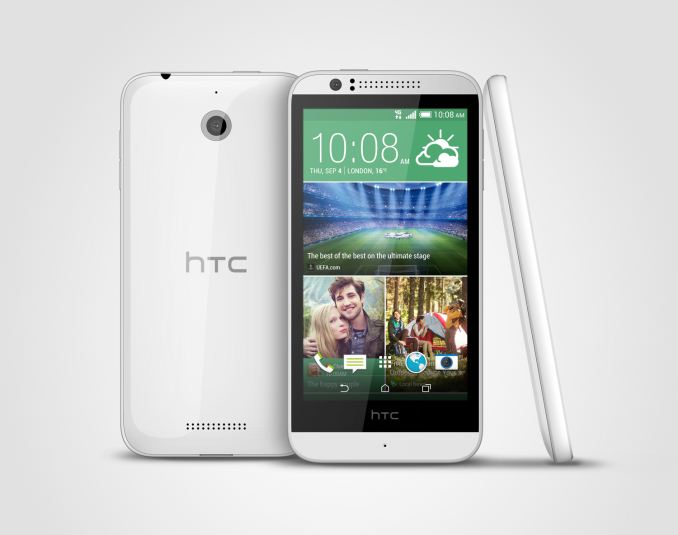
While normally one might expect high end phones to get the latest and greatest features first, this time we see a bit of a surprising reversal. The Desire 510 is HTC’s first 64-bit phone, and the first announced device with Snapdragon 410. For those that aren’t familiar with Snapdragon 410, it has four Cortex A53 CPU cores running at 1.2 GHz, along with an Adreno 306 GPU which suggests that it is a mild modification of the current Adreno 305 GPU that we see in the Snapdragon 400. Overall, this should make for a quite fast SoC compared to Snapdragon 400, as Anand has covered in the Snapdragon 410 launch announcement.

While it may seem strange that ARMv8 on Android phones is first to appear on a budget smartphone, it’s quite easy to understand how this happened. Looking at Qualcomm’s roadmap, the Snapdragon 810/MSM8994 is the first high-end SoC that will ship with ARMv8, and is built on a 20nm process. As 20nm from both Samsung and TSMC have just begun appearing in shipping chips, the process yield and production capacity isn’t nearly as mature as 28nm LP, which is old news by now.

At any rate, outside of the SoC the Desire 510 is a relatively standard budget phone. As this phone ships with Android 4.4 it’s likely that it is running in AArch32 mode only, with AArch64 coming with Android L. The display is a 4.7″ size, with FWVGA resolution (854×480) which makes for a rather low 208 DPI. This will be the cheapest LTE phone in HTC’s product line, and also has support for a Dot View case. I’ve included the rest of the specs below, but for the most part the key point of interest is the SoC.

  HTC Desire 510
SoC MSM8916 1.2 GHz Snapdragon 410
RAM/NAND 1 GB RAM, 8GB NAND + microSD
Display 4.7” FWVGA (854×480)
Network 2G / 3G / 4G LTE (Qualcomm MDM9x25 UE Category 4 LTE)
Dimensions 139.9 x 69.8 x 9.99mm, 158 grams
Camera 5MP rear camera, .3MP/VGA FFC
Battery 2100 mAh (7.98 Whr)
OS Android 4.4 with Sense 6
Connectivity 802.11b/g/n + BT 4.0, USB2.0, GPS/GNSS, DLNA
SIM Size MicroSIM

The only additional comment I have to make is that there is no 5 GHz WiFi. This is probably a WCN3620 part like the Moto G. While there’s no word on pricing, HTC will have to price this near the price of the Moto G for it to be reasonably competitive. The Desire 510 should find its way to Europe, Asia, and the United States.

HTC Announces Desire 510: First 64-bit Android Phone

HTC Announces Desire 510: First 64-bit Android Phone

While normally one might expect high end phones to get the latest and greatest features first, this time we see a bit of a surprising reversal. The Desire 510 is HTC’s first 64-bit phone, and the first announced device with Snapdragon 410. For those that aren’t familiar with Snapdragon 410, it has four Cortex A53 CPU cores running at 1.2 GHz, along with an Adreno 306 GPU which suggests that it is a mild modification of the current Adreno 305 GPU that we see in the Snapdragon 400. Overall, this should make for a quite fast SoC compared to Snapdragon 400, as Anand has covered in the Snapdragon 410 launch announcement.

While it may seem strange that ARMv8 on Android phones is first to appear on a budget smartphone, it’s quite easy to understand how this happened. Looking at Qualcomm’s roadmap, the Snapdragon 810/MSM8994 is the first high-end SoC that will ship with ARMv8, and is built on a 20nm process. As 20nm from both Samsung and TSMC have just begun appearing in shipping chips, the process yield and production capacity isn’t nearly as mature as 28nm LP, which is old news by now.

At any rate, outside of the SoC the Desire 510 is a relatively standard budget phone. As this phone ships with Android 4.4 it’s likely that it is running in AArch32 mode only, with AArch64 coming with Android L. The display is a 4.7″ size, with FWVGA resolution (854×480) which makes for a rather low 208 DPI. This will be the cheapest LTE phone in HTC’s product line, and also has support for a Dot View case. I’ve included the rest of the specs below, but for the most part the key point of interest is the SoC.

  HTC Desire 510
SoC MSM8916 1.2 GHz Snapdragon 410
RAM/NAND 1 GB RAM, 8GB NAND + microSD
Display 4.7” FWVGA (854×480)
Network 2G / 3G / 4G LTE (Qualcomm MDM9x25 UE Category 4 LTE)
Dimensions 139.9 x 69.8 x 9.99mm, 158 grams
Camera 5MP rear camera, .3MP/VGA FFC
Battery 2100 mAh (7.98 Whr)
OS Android 4.4 with Sense 6
Connectivity 802.11b/g/n + BT 4.0, USB2.0, GPS/GNSS, DLNA
SIM Size MicroSIM

The only additional comment I have to make is that there is no 5 GHz WiFi. This is probably a WCN3620 part like the Moto G. While there’s no word on pricing, HTC will have to price this near the price of the Moto G for it to be reasonably competitive. The Desire 510 should find its way to Europe, Asia, and the United States.

Google's News & Weather App Updated to Version 2.0

Google’s News & Weather App Updated to Version 2.0

Today Google has rolled out an unexpected update to an app that seemed long forgotten. It’s the News & Weather application that comes on Android phones running software maintained by Google like Nexus and Google Play Edition devices. The big change with the update is a complete design overhaul that implements Google’s Material Design principles. The app previously sported a design that was like a relic from the distant past, with an interface that seemed like a mixture between Android Gingerbread design and some parts of Google’s original Holo design from Android Ice Cream Sandwich. There was heavy use of black, with horizontal scrolling sections and gradients throughout.

Old News & Weather on the left, new on the right.

The new design is like a breath of fresh air. I had not even used the old app to change the temperature units from Fahrenheit to Centigrade because the design was so outdated that I looked to other apps to get weather and news information. The weather images had also not been updated to support very high resolution devices in the 400+ ppi range, and looked quite blurry. The new design does away with the black color scheme and features information displayed on white cards with high resolution weather images. The tabs at the top have also been removed, and all weather and news information is displayed in a single vertically scrolling list. Specific news topics can be accessed by the navigation pane that slides in from the left. Information about temperature and precipitation trends can be revealed by tapping the downward arrow on the weather card.

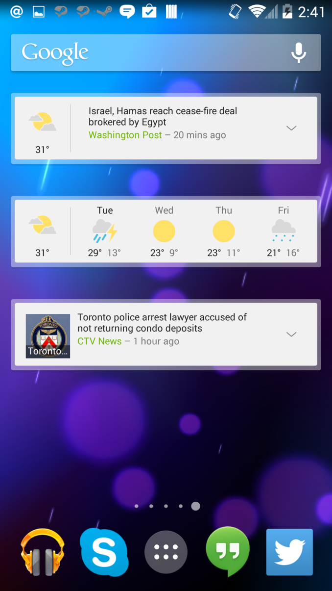
Old News & Weather widgets on the left, new on the right.

The widgets for the app also receive a makeover. The app maintains the options for news + weather, news only, and weather only, with the weather only widget being changed to display the forcast for the coming days rather than just the current weather. The widgets also have a semi-transparent border around them, which may be another element in Google’s new design language.

News & Weather 2.0 is out on Google Play now. Like all of Google’s updates, it may take some time before your device receives it.