Smartphones


Microsoft Announces Mobile Restructuring With Up To 7,800 Job Cuts

Microsoft Announces Mobile Restructuring With Up To 7,800 Job Cuts

A little more than a year ago Nokia officially ceased to exist as a mobile phone manufacturer. Nokia’s efforts to reverse their decline in the mobile space by adopting Microsoft’s Windows Phone operating system were unsuccessful, and eventually the company decided to exit from the mobile phone market entirely by selling their devices business to Microsoft. Former Microsoft CEO Steve Ballmer had stated that Microsoft was evolving from a traditional software company to become a devices and services company. With that mindset, the acquisition of Nokia made sense in order to acquire manufacturing, design, and software talent that had already been working on Windows Phones for quite some time.

Unfortunately, it appears that the purchase of Nokia’s devices division has not worked out as well as Microsoft had hoped. New CEO Satya Nadella has also reversed course on the Devices and Services mantra and is instead focusing on software and services, but with first party hardware to showcase the software. After laying off 12,500 former Nokia employees last year, Microsoft has announced that will be eliminating up to 7,800 positions, with most of the cuts coming in areas of Microsoft focused on phones. In addition to the job cuts, Microsoft will be writing off 7.6 billion dollars which is essentially the entire value of the Nokia acquisition. There will also be a $750-$850 million restructuring charge. All-in-all, it’s a big hit to their bottom line, and even companies that make billions every year have to answer to investors about charges like this. It is an even bigger write down than they took on the AQuantive deal a few years ago.

In an email to employees regarding Microsoft’s future in the mobile business, CEO Satya Nadella stated “In the near-term, we’ll run a more effective and focused phone portfolio while retaining capability for long-term reinvention in mobility.” One could interpret this as Microsoft consolidating their phone lineup which has arguably become a bit too large and filled with devices that only differ from each other in small ways. It’s likely that the launch of Windows 10 for phones will be accompanied by more information about the future of Microsoft’s phone business, but for the time being it appears that Microsoft is taking a step back from their role as a major devices company.


Meizu Announces The MX5

Meizu Announces The MX5

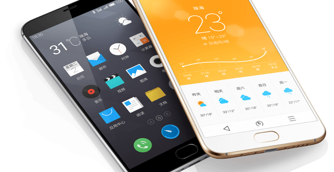
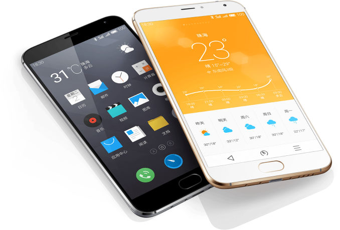
Today at Meizu’s event in China the company presented their new flagship phone, the MX5. The MX5 is the successor to the MX4 released last year, and while I haven’t been able to review that unit yet, I did take an extensive look at its bigger brother, the MX4Pro.

The MX5’s biggest characteristic is the change in display technology. Meizu has now adopted Samsung’s AMOLED screen in place of the traditional LCD technology. This also leads to a change in form-factor as now Meizu had to abandon its 16:10 aspect-ratio for the more conventional 16:9 resolutions. At 1080p and 5.5″ diagonal, the screen isn’t as high resolution as one might have expected and thus regresses in terms of DPI in comparison to the MX4. This is a diamond-structure PenTile subpixel arrangement so the effective resolution is thus even less than the MX4, something one might have to be wary of in a 5.5″ phone such as this.

An important metric is power consumption, the MX5 is supposed to use up 40% less power than the MX4’s screen, this might point out that PSR is now being employed on the new unit as the MX4 notoriously suffered from a lack of the technology. The screen is protected by Gorilla Glass 3.

Meizu MX5 Specifications
SoC MediaTek Helio X10 MT6795
8x Cortex A53 @ 2.2GHz
PowerVR G6200 @ 700MHz+
RAM 3GB LPDDR3-1600
NAND / Storage 16 / 32 / 64GB
Display 5.5″ 1920×1080 SuperAMOLED
Network 2G / 3G / 4G LTE
FDD-LTE / TD-LTE / TD-SCDMA / WCDMA / GSM
(Chinese Bands)
Dimensions 149.9 x 74.7 x 7.6mm
149 grams
Camera 20.7MP Sony IMX220 sensor F/2.2 Main camera
w/ Laser auto-focus

5MP F/2.0 Front camera

Battery 3150mAh
OS Android 5.0
with Meizu FlymeOS 4.5
Connectivity 802.11 b/g/n/ac + BT 4.1 + BLE, USB2.0, GPS/GNSS
SIM Size nanoSIM + nanoSIM

Meizu continues to employ MediaTek’s SoCs in its device as we see the MX5 use a new Helio X10 / MT6795. This is a successor to the MT6595 which employed A17 and A7 cores in a big.LITTLE configuration. I was fairly impressed with the performance and battery life of the MT6595 itself, while I’m sort of doubtful the new A53 cores will be able to outperform it in real use-cases, it should still work very well and also improve battery life for the new device. The MX5 comes with a standard 3GB of LPDDR3 memory.

Due to the screen’s change in aspect ratio, the MX5 is 6mm taller than the MX4, although width has gone down 0.5mm and the new phone is now also thinner at 7.6 instead of 8.9mm – all without sacrificing battery capacity (And likely battery life) as it now actually even gains 50mAh for a total of 3150mAh.

The camera system remains largely the same, but Meizu now uses a better lens system that is supposed to improve quality of the image. This is still a Sony IMX220 20.7MP sensor with an F2.2 aperture lens. What is new is that there’s now a laser auto-focus system right under the flash LED, enabling fast-focus for down to 0.2s according to Meizu.

The fingerprint sensor that we’ve seen on the MX4Pro carries over to the MX5, enabling a variety of OS security functions such as unlocking the device or accessing private folders or galleries on your phone.

The phone ships with Meizu’s FlymeOS 4.5 Android 5.0 operating system. The interesting part here is that Meizu announced its plans to open-source parts of the OS and upload them to GitHub for community development. This might attract a lot of enthusiast users as having a modding-friendly device can vastly increase the life-span of a model beyond what the OEM is willing to offer in terms of support.

For now the device is aimed at the Chinese market (And thus only offers limited western frequency bands) coming in at ¥ 1799, ¥ 1999 and ¥ 2399 (USD $290, $320, $386) price-points for 16, 32 or 64GB versions.

Source: Meizu

Meizu Announces The MX5

Meizu Announces The MX5

Today at Meizu’s event in China the company presented their new flagship phone, the MX5. The MX5 is the successor to the MX4 released last year, and while I haven’t been able to review that unit yet, I did take an extensive look at its bigger brother, the MX4Pro.

The MX5’s biggest characteristic is the change in display technology. Meizu has now adopted Samsung’s AMOLED screen in place of the traditional LCD technology. This also leads to a change in form-factor as now Meizu had to abandon its 16:10 aspect-ratio for the more conventional 16:9 resolutions. At 1080p and 5.5″ diagonal, the screen isn’t as high resolution as one might have expected and thus regresses in terms of DPI in comparison to the MX4. This is a diamond-structure PenTile subpixel arrangement so the effective resolution is thus even less than the MX4, something one might have to be wary of in a 5.5″ phone such as this.

An important metric is power consumption, the MX5 is supposed to use up 40% less power than the MX4’s screen, this might point out that PSR is now being employed on the new unit as the MX4 notoriously suffered from a lack of the technology. The screen is protected by Gorilla Glass 3.

Meizu MX5 Specifications
SoC MediaTek Helio X10 MT6795
8x Cortex A53 @ 2.2GHz
PowerVR G6200 @ 700MHz+
RAM 3GB LPDDR3-1600
NAND / Storage 16 / 32 / 64GB
Display 5.5″ 1920×1080 SuperAMOLED
Network 2G / 3G / 4G LTE
FDD-LTE / TD-LTE / TD-SCDMA / WCDMA / GSM
(Chinese Bands)
Dimensions 149.9 x 74.7 x 7.6mm
149 grams
Camera 20.7MP Sony IMX220 sensor F/2.2 Main camera
w/ Laser auto-focus

5MP F/2.0 Front camera

Battery 3150mAh
OS Android 5.0
with Meizu FlymeOS 4.5
Connectivity 802.11 b/g/n/ac + BT 4.1 + BLE, USB2.0, GPS/GNSS
SIM Size nanoSIM + nanoSIM

Meizu continues to employ MediaTek’s SoCs in its device as we see the MX5 use a new Helio X10 / MT6795. This is a successor to the MT6595 which employed A17 and A7 cores in a big.LITTLE configuration. I was fairly impressed with the performance and battery life of the MT6595 itself, while I’m sort of doubtful the new A53 cores will be able to outperform it in real use-cases, it should still work very well and also improve battery life for the new device. The MX5 comes with a standard 3GB of LPDDR3 memory.

Due to the screen’s change in aspect ratio, the MX5 is 6mm taller than the MX4, although width has gone down 0.5mm and the new phone is now also thinner at 7.6 instead of 8.9mm – all without sacrificing battery capacity (And likely battery life) as it now actually even gains 50mAh for a total of 3150mAh.

The camera system remains largely the same, but Meizu now uses a better lens system that is supposed to improve quality of the image. This is still a Sony IMX220 20.7MP sensor with an F2.2 aperture lens. What is new is that there’s now a laser auto-focus system right under the flash LED, enabling fast-focus for down to 0.2s according to Meizu.

The fingerprint sensor that we’ve seen on the MX4Pro carries over to the MX5, enabling a variety of OS security functions such as unlocking the device or accessing private folders or galleries on your phone.

The phone ships with Meizu’s FlymeOS 4.5 Android 5.0 operating system. The interesting part here is that Meizu announced its plans to open-source parts of the OS and upload them to GitHub for community development. This might attract a lot of enthusiast users as having a modding-friendly device can vastly increase the life-span of a model beyond what the OEM is willing to offer in terms of support.

For now the device is aimed at the Chinese market (And thus only offers limited western frequency bands) coming in at ¥ 1799, ¥ 1999 and ¥ 2399 (USD $290, $320, $386) price-points for 16, 32 or 64GB versions.

Source: Meizu

Google Updates Hangouts For iOS With A New Interface

Google Updates Hangouts For iOS With A New Interface

Today Google shipped an update for their Hangouts application on iOS. The update brings the version number to 4.0, and rightfully so as it comes with a new design for the entire application. Although this is an iOS application, it feels very much like an Android application as it follows the same Material Design principles that Google’s Android applications use.

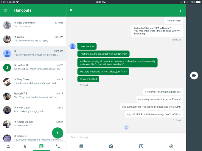
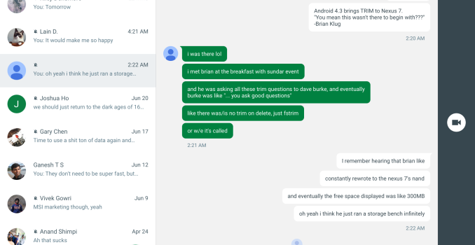
Above you can see the conversation view for the application running on an iPad. It still retains the bar to initiate a call with the person on the right hand side, which may pose a problem in the near future when users pull from that side to initiate multitasking on iPads running iOS 9. There are a few other iPad specific changes, such as a green circular send button that only appears when you’ve inputted text. The app has some issues with rendering on the iOS 9 beta so I can’t take screenshots of them. All of the other changes that I note below exist within both versions, with the exception of UI elements that only exist in one of the layouts such as the navigation buttons at the bottom.

Old UI on the left, new UI on the right

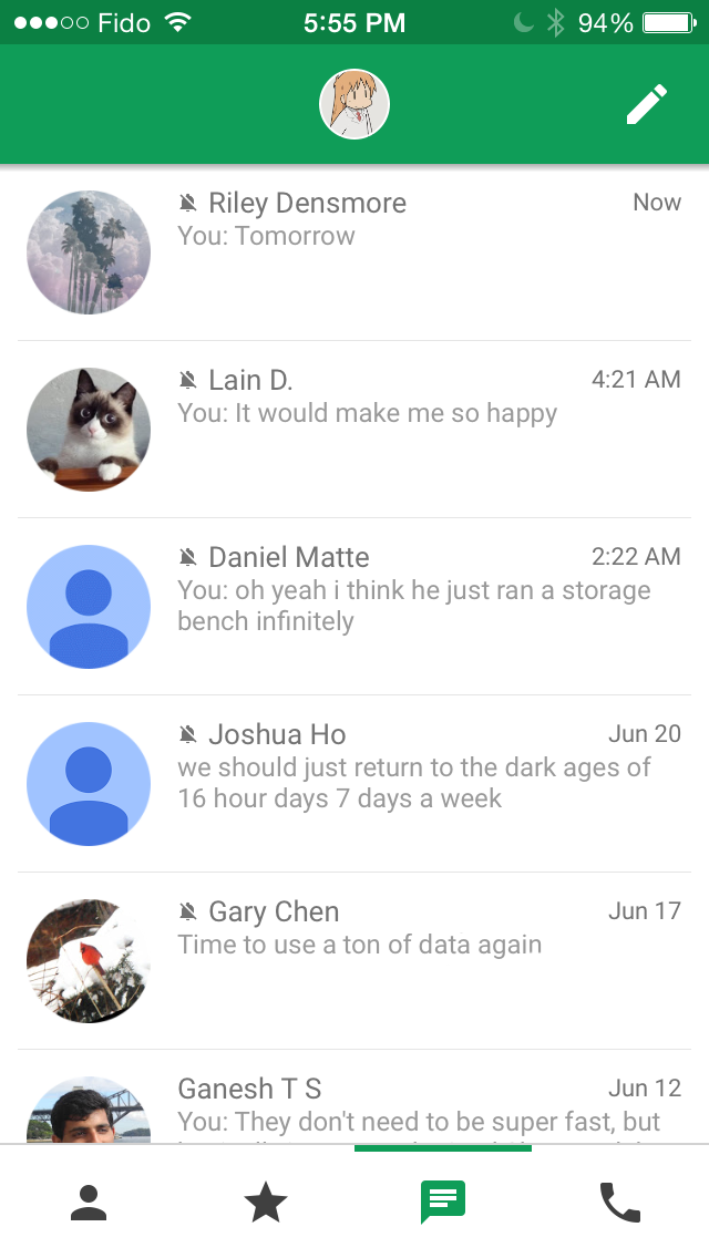
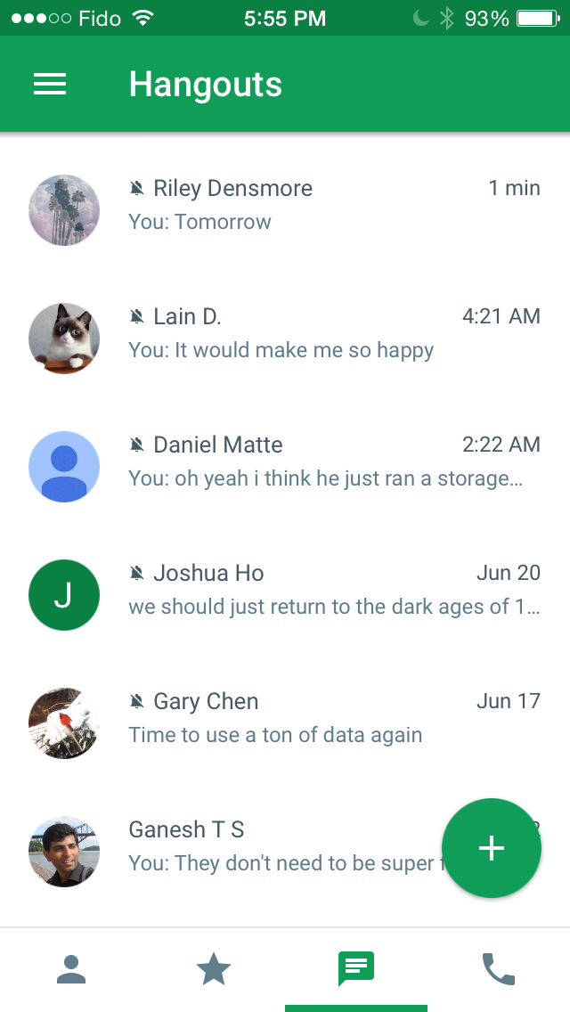
The main screen of the application only receives a few changes, but they’re noticable. The app now adopts the circular button for starting a new conversation that has become standard in Google’s applications, as well as the navigation drawer which can be accessed using the hamburger button in the top left. This is a difficult situation, because while the navigation drawer is used within all of Google’s applications on Android, it’s discouraged by Apple and their design guidelines for iOS applications. I think in this situation it would probably be better for Google to follow the guidelines of the platform they’re designing for even if it means there has to be some fragmentation between the design of their apps on iOS and Android.

In addition to the new forms of navigation, there are some subtle tweaks as well. The fonts now use a thicker weight and are a blue color as opposed to the light grey they used previously. The increased contrast makes text a lot easier to read. This blue color is also used for the navigation buttons at the bottom. The only other tweaks I’ve noticed is the green bar indication which section you’re in being moved from above the navigation buttons to below, and the separation lines between conversations being removed, which is something Google has done with their other applications as they redesigned them to follow the Material Design guidelines.

Old UI on the left, new UI in the middle and on the right

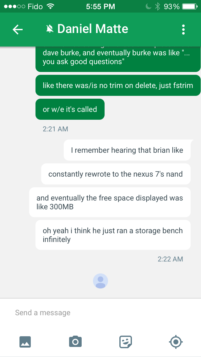
Once you go into a conversation you’ll see that Google has been doing a lot of work to update the appearance of the app. The green color of the bubbles now better fits with the green color that Hangouts uses, and now the green bubbles are the ones sent by your conversation partner rather than by you. The bubbles themselves are also more rounded than they were before. Text within the white bubbles doesn’t use the same blue used for the text in the conversation view, but it seems to be a lighter color than the black used before because there’s visibly lower contrast between it and the white backgrounds. Text within the green bubbles now uses a white color to contrast with the dark text in the white bubbles.

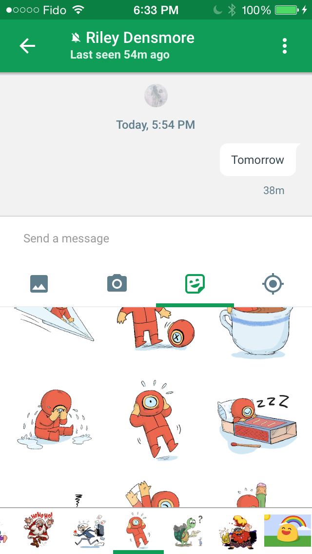
The input field also receives a number of changes. Rather than having a paperclip that leads to another menu, Google has exposed all the options for sending media right underneath the text box. This means that you don’t fit quite as many messages on the screen as before, but I think it’s a worthwhile change. You can now send images, take images to send, and send various little pictures to the person you’re conversing with. Location sharing is supported as well, and the photos button allows you to send multiple photos at once.

Hangouts 4.0 for iOS is rolling out on the App Store, and you should be able to download it now for any iPhones, iPads or iPod Touches that you own. The new interface hasn’t come to Android yet, but there have been recent leaks of a similar looking redesign on Android, and Google says that it will be coming soon.

Google Updates Hangouts For iOS With A New Interface

Google Updates Hangouts For iOS With A New Interface

Today Google shipped an update for their Hangouts application on iOS. The update brings the version number to 4.0, and rightfully so as it comes with a new design for the entire application. Although this is an iOS application, it feels very much like an Android application as it follows the same Material Design principles that Google’s Android applications use.

Above you can see the conversation view for the application running on an iPad. It still retains the bar to initiate a call with the person on the right hand side, which may pose a problem in the near future when users pull from that side to initiate multitasking on iPads running iOS 9. There are a few other iPad specific changes, such as a green circular send button that only appears when you’ve inputted text. The app has some issues with rendering on the iOS 9 beta so I can’t take screenshots of them. All of the other changes that I note below exist within both versions, with the exception of UI elements that only exist in one of the layouts such as the navigation buttons at the bottom.

Old UI on the left, new UI on the right

The main screen of the application only receives a few changes, but they’re noticable. The app now adopts the circular button for starting a new conversation that has become standard in Google’s applications, as well as the navigation drawer which can be accessed using the hamburger button in the top left. This is a difficult situation, because while the navigation drawer is used within all of Google’s applications on Android, it’s discouraged by Apple and their design guidelines for iOS applications. I think in this situation it would probably be better for Google to follow the guidelines of the platform they’re designing for even if it means there has to be some fragmentation between the design of their apps on iOS and Android.

In addition to the new forms of navigation, there are some subtle tweaks as well. The fonts now use a thicker weight and are a blue color as opposed to the light grey they used previously. The increased contrast makes text a lot easier to read. This blue color is also used for the navigation buttons at the bottom. The only other tweaks I’ve noticed is the green bar indication which section you’re in being moved from above the navigation buttons to below, and the separation lines between conversations being removed, which is something Google has done with their other applications as they redesigned them to follow the Material Design guidelines.

Old UI on the left, new UI in the middle and on the right

Once you go into a conversation you’ll see that Google has been doing a lot of work to update the appearance of the app. The green color of the bubbles now better fits with the green color that Hangouts uses, and now the green bubbles are the ones sent by your conversation partner rather than by you. The bubbles themselves are also more rounded than they were before. Text within the white bubbles doesn’t use the same blue used for the text in the conversation view, but it seems to be a lighter color than the black used before because there’s visibly lower contrast between it and the white backgrounds. Text within the green bubbles now uses a white color to contrast with the dark text in the white bubbles.

The input field also receives a number of changes. Rather than having a paperclip that leads to another menu, Google has exposed all the options for sending media right underneath the text box. This means that you don’t fit quite as many messages on the screen as before, but I think it’s a worthwhile change. You can now send images, take images to send, and send various little pictures to the person you’re conversing with. Location sharing is supported as well, and the photos button allows you to send multiple photos at once.

Hangouts 4.0 for iOS is rolling out on the App Store, and you should be able to download it now for any iPhones, iPads or iPod Touches that you own. The new interface hasn’t come to Android yet, but there have been recent leaks of a similar looking redesign on Android, and Google says that it will be coming soon.