Vik


Testing Improved 4K Display Support in OS X 10.9.3

Testing Improved 4K Display Support in OS X 10.9.3

Today Apple released the long awaited OS X 10.9.3 update. The update comes after nine weeks of beta testing, each week with a new release. One of the most interesting things about the update is not in its content but in how Apple opened up their beta seed program to all users when it was traditionally reserved for those who are part of Apple’s developer program.

The most major improvement of the update is the improved 4K (3840×2160) display support on OS X. Prior to 10.9.3 the support for 4K displays on OS X was lacking. Only a small group of monitors from ASUS and Sharp were supported for running at 3840×2160 with a 60Hz refresh rate, and the scaled display options that Apple introduced with the original Macbook Pro with Retina Display were unavailable. This made for poor usability on monitors like the Dell UP2414Q which is only 24” and has extremely small UI elements when running unscaled at its native resolution. In 10.9.3 Apple has greatly expanded the list of compatible 4K displays and has introduced scaling modes for those who prefer sharper UI elements over display real estate.
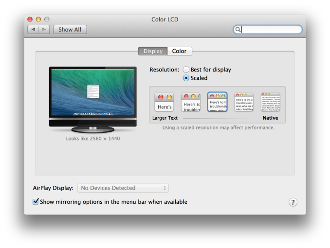
Anand took a look at the changes to 4K support in the first beta of 10.9.3. Apple now gives the user options for display scaling which includes settings for a workspace that looks like 3200×1800, 2560×1440, 1920×1080, or 1280×720. All of these are handled the same way as on the Macbook Pro with Retina Display where the display is rendered offscreen at twice the selected vertical and horizontal resolution and then scaled down to the panel. In the case of the 3200×1800 setting this means that the display is rendered offscreen at 6400×3600 which may cause performance issues when being driven with the Intel Iris graphics of a Macbook Pro with Retina Display or the entry level 21.5” iMac.

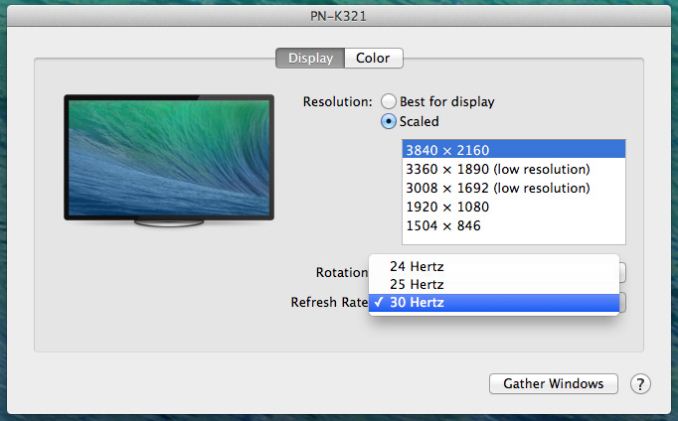
With 10.9.3 Apple has not only broadly increased support for 4K displays, but also enabled 60Hz output to 4K displays on more systems. The Dell UP2414Q, a 24″ 3840 x 2160 display, is now properly supported by OS X and Macs that can drive it at its native resolution. Apple appears to have manually added a profile for the UP2414Q as its scaled resolutions are somewhat different from the 30″ Sharp/ASUS 4K panels.

Apple OS X 10.9.3 4K Display Handling
Scaled Resolution ASUS/Sharp 30″ 4K Dell 24″ 4K (UP2414Q)
Best for Display Setting 3840 x 2160 1080p Hi-DPI
Scaled Resolution 1 1504 x 846 (3008 x 1692) 1504 x 846 (3008 x 1692)
Scaled Resolution 2 1920 x 1080 (3840 x 2160) 1920 x 1080 (3840 x 2160)
Scaled Resolution 3 2560 x 1440 (5120 x 2880) 2304 x 1296 (4608 x 2592)
Scaled Resolution 4 3008 x 1692 (6016 x 3384) 2560 x 1440 (5120 x 2880)
Scaled Resolution 5 3840 x 2160 3008 x 1692 (6016 x 3384)

There is no native 3840 x 2160 resolution exposed on the UP2414Q and by default OS X appears to want to run the panel in a 1080p Hi-DPI mode. This is similar to what happens on the rMBPs where text/UI elements appear as they would on a 1080p display, while images, videos and other similar objects appear as they would on a 3840 x 2160 display.

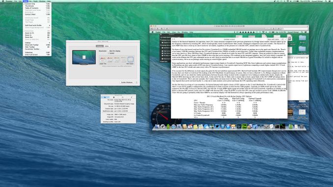
The 24″ 4K panel gains a new intermediate scaled mode of 2304 x 1296. The table above shows the frame buffer resolution in paratheses. For example, the screenshot below was taken with the UP2414Q set to its highest scaled resolution (3008 x 1692). The full untouched PNG weighs in at 19.8MB from OS X and is a 6016 x 3384 image. At the highest scaled resolution setting the frame buffer is now over 20 megapixels (excluding the 5MP primary Retina Display), which is just insane. The screenshot open in Preview (screenshot within the screenshot) is a 2880 x 1800 screenshot, open at full size. Note how little space the screenshot occupies. Apple’s Hi-DPI scaling and seamless integration across the ecosystem continues to be awesome.

Along with expanded display support, some new Macs also get the ability to drive 4K panels at 60Hz. By some I mean one: the 15-inch MacBook Pro with Retina Display from late 2013. This is the Haswell refresh of the rMBP15, and it remains the only portable Mac capable of driving a 4K panel at 60Hz over either of its two miniDP ports (HDMI is limited to 30Hz).

The 13-inch Haswell rMBP unfortunately doesn’t support 4K60, although you can use its HDMI port to drive a 4K panel at 30Hz (I noted MST compatibility issues when trying to use the 2013 rMBP13’s miniDP out). I suspect this has more to do with performance than a physical hardware limitation, as even running the 13-inch rMBP’s primary display at a high frame rate can be a chore with a lot of windows open. The 15-inch 2013 rMBP forces the use of its GeForce GT 750M whenever you connect an external display, which helps ensure a better experience when driving a couple of high res displays. Obviously the new Mac Pro works just fine with these displays as well.

Update: As many of you have pointed out, the base 15-inch 2013 rMBP also lacks a discrete GPU. Apple doesn’t specifically exclude the entry level 15-inch rMBP in its release notes. Driving ultra high resolutions (up to nearly 26MP across two displays) is mostly an exercise in memory bandwidth and ROP performance. The 15-inch rMBP benefits from having Intel’s Crystalwell eDRAM on-package, which should help tremendously in the memory bandwidth department at least. If anything, the lack of Crystalwell is probably what keeps the 13-inch rMBP from getting access to the higher scaled resolution modes at least.

Beyond the improvements to 4K support Apple has also included various stability and security improvements. 10.9.3 also bundles the Safari 7.0.3 update which brings along its own bundle of security patches. The full changelog for the update is as follows:

  • Improves 4K display support on Mac Pro (Late 2013) and MacBook Pro with 15-inch Retina Display (Late 2013)
  • Adds the ability to sync contacts and calendars between a Mac and iOS device using a USB connection
  • Improves the reliability of VPN connections using IPsec
  • Resolves an issue that prevented Font Book from installing PostScript Type 1 fonts
  • Improves reliability of copying, editing and inspecting permissions of files on an SMB file server
  • Improves reliability of network home directories
  • Improves stability when installing configuration profiles
  • Improves login speed for users in Active Directory groups
  • Includes Safari 7.0.3

OS X 10.9.3 is available now to all Mac users with a computer that supports OS X Mavericks. The changelog for the update is available in the source below and Apple will put up a page detailing the security content of the update on their security page shortly.

Source: Apple

14 Days of Humble Bundles #3: Banner Saga

14 Days of Humble Bundles #3: Banner Saga

The next update to Humble’s 14 Days of Bundles brings us RPG mixed with tactical combat, all wrapped up in a crunchy Viking shell. This is a bit of an interesting bundle as the core game – The Banner Saga: Factions – is actually Free to Play, which of course means it’s supported by micro transactions or other forms of monetization. The core content is “name your price”, so for as little as one penny you can get the Starter Pack (normally $1.99) along with a collection of artwork from the game. That might not seem like much, but at least it’s (potentially) only a penny, though you can always pay more if you’re being generous. Beating the average price will also get you the Variations Pack (normally $9.99), while a donation of $15 or more will get you the full Banner Saga game (normally $24.99).

I need to clarify what you’re really getting, though. The Banner Saga: Factions game (67%, 02/2013) is actually multi-player only and involves you fighting against other humans in tactical battles. I tried it briefly – it’s free, after all – and depending on your feelings for PvP battles it could be a nice way to pass the time. Me, I’m a bit of a gaming recluse these days and like my games to be single-player affairs, so it’s not really my thing. That means the core package doesn’t do me much good, as the Starter Pack just unlocks four rank 1 units. The Variations Pack isn’t any use either, as that’s merely 12 variations on each advanced class that you can use when you promote them, again for the Factions portion of the game. So the real draw here would be for the Banner Saga single-player game (80%, 01/2014), which means you have to donate at least $15. At least the game has received decent reviews from the gaming critics, with many comparing it to a Norse variant of Game of Thrones.

The story of how the Banner Saga came to be is also somewhat interesting, as it came to life as part of a Kickstarter project back in April, 2012. With an initial goal of $100,000, developer Stoic more than reached that target with $723,000+ raised during the funding period. Stoic consists for just three people, with a background in game design that includes credits like The Old Republic. There’s one developer and two artists, and with their combined talents they were able to crank out the single-player game in just under two years. The graphics largely consist of comic-style art with some rather nice backgrounds, as you can see from the screen shots.

Short summary: today’s Banner Saga bundle is a good way to get into the single-player game for $15 instead of the usual $25, which means you’re only paying $5 more than the early Kickstarter backers for the game. The Factions aspect doesn’t seem to be well populated from what I’ve seen, though this Kickstarter might add some new players to the mix, and personally I didn’t find much there to keep me playing. Most people seem to feel the same, given that the current average price is currently $10.91 with over 3000 copies sold, so it looks like buyers are going for the $15+ donation. If you need something else to occupy your time, check out Humble’s Weekly Bundle, which includes several platforming games.

Samsung SSD XP941 Review: The PCIe Era Is Here

For most of the last decade, SATA has been the dominant interface in the consumer storage space. As long as hard drives were the major media for storage, SATA provided everything that the industry needed. It was fast, efficient and low in cost. But …

Xiaomi Announces the MiPad: The First Tegra K1 Device

Xiaomi Announces the MiPad: The First Tegra K1 Device

Today Xiaomi introduced its first tablet: the MiPad. The tablet bears similarity to both Apple’s iPad Mini and iPhone 5c. On the front of the tablet we have a 7.9” 2048×1536 IPS display (sourced from both Sharp and AUO Optronics) which is surrounded by an asymmetrical bezel. On the back we have a plastic shell of multiple different colors which Xiaomi itself states is made with the same injection molding technology as the iPhone 5c. There is also an 8MP Sony camera on the back with an F/2.0 aperture, and a 5MP camera on the front. The most interesting part of the Mi Pad is not on the outside, it’s on the inside. The MiPad is the first consumer device to be announced that is powered by NVIDIA’s Tegra K1 SoC.

As you may recall, NVIDIA introduced Tegra K1 to the world at CES 2014. It marks a huge departure from NVIDIA’s mobile graphics strategy, abandoning the old Tegra GPU roadmap in favor of its desktop Kepler architecture.

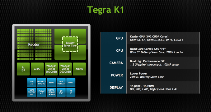
Tegra K1 has two flavors, both built on a 28nm HPm process. One uses NVIDIA’s Project Denver which will include two custom ARMv8 cores designed by NVIDIA. Denver is not slated to ship until later this year and so what we see in the MiPad is the other flavor of Tegra K1 which is a quad core ARM Cortex A15 design. Similar to other recent Tegra SoCs, this version of the K1 features four Cortex A15s plus an additional companion Cortex A15 optimized for lower frequencies for periods of low CPU usage. The CPU cores are based on a newer revision of Cortex A15 (r3p3) which includes finer grain power gating to reduce power consumption compared to revision r2p1 in the Tegra 4. This increase in efficiency will help balance out NVIDIA’s move from a 1.9GHz max clock speed on Tegra 4 to over 2GHz on Tegra K1 (the move to 28nm HPm should help as well). The Tegra K1 SoC in the MiPad will ship with a max clock speed of 2.2GHz and 2GB of LPDDR3 RAM.

The GPU on Tegra K1 is something completely different from previous Tegra designs. Previous Tegra chips integrated NVIDIA’s GeForce ULP core designed exclusively for its mobile platforms. With Tegra K1 Nvidia abandoned the idea of having a separate mobile roadmap for GPU designs and has merged its mobile and PC GPU roadmaps. The result is that Tegra K1 and all subsequent designs will ship with GPUs using the same architecture as NVIDIA’s PC parts. With Tegra K1 we get a complete implementation of NVIDIA’s Kepler architecture with 192 CUDA cores, 4 ROPs, and 8 texture units. It also brings along OpenGL ES 3.0, OpenGL 4.4, DirectX 11, CUDA 6.0, and every other API that Kepler supports.

NVIDIA has also shown a commitment to releasing software that will take advantage of their mobile GPUs. The company recently worked with Valve to bring Half Life 2 and Portal over to the NVIDIA Shield which is powered by a Tegra 4 CPU and I am sure that crafty users will bring the apps over to Tegra K1 devices if NVIDIA does not do so itself.

Beyond the SoC, the other internal specs for the MiPad include a 25.46 Whr (6700mAh) battery, 16 or 64GB of internal NAND, and a MicroSD slot. Connectivity includes support for 802.11 b/g/n/ac and Bluetooth 4.0. As with other Xiaomi devices, the MiPad runs Android with the MIUI UI atop it. It will launch in China sometime in June priced at 1499 yuan ($240) for the 16GB model and 1699 yuan ($272) for the 64GB model.

Source: Xiaomi via The Verge

HTC One mini 2 Announcement

HTC One mini 2 Announcement

Today, HTC is launching the HTC One mini 2, a phone that is supposed to be a smaller version of the HTC One (M8), both in price and size. As a direct successor to the HTC One mini, a surprising amount has changed. The camera is no longer the Ultrapixel sensor, the display and overall size increase, NFC shows up, and the SoC has been changed to use a quad core Cortext A7 setup over the dual core Krait setup from last year. A list of the differences between the One mini, One mini 2, and One (M8) can be seen below.

  HTC One mini 2 HTC One (M8) HTC One mini
SoC MSM8926 1.2 GHz Snapdragon 400 MSM8974ABv3 2.3 GHz Snapdragon 801 MSM8930 1.4 GHz Snapdragon 400
RAM/NAND 1 GB, 16GB NAND + microSD 2GB LPDDR3, 16/32GB NAND + microSD 1 GB LPDDR2, 16GB NAND
Display 4.5” 720p LCD 5” 1080p LCD 4.3″ 720p LCD
Network 2G / 3G / 4G LTE (Qualcomm MDM9x25 UE Category 4 LTE) 2G / 3G / 4G LTE (Qualcomm MDM9x25 UE Category 4 LTE) 2G / 3G / 4G LTE (Qualcomm MDM9x15 UE Category 3 LTE)
Dimensions 137.43 x 65.04 x 10.6mm, 137 grams 146.36 x 70.6 x 9.35mm max, 160 grams 132 x 63.2 x 9.25 mm, 122 grams
Camera 13MP rear camera, 1.12 µm pixels, 1/3.06″ CMOS size, F/2.2. 5MP f/2.0 FFC 4.0 MP (2688 × 1520) Rear Facing with 2.0 µm pixels, 1/3″ CMOS size, F/2.0, 28mm (35mm effective) and rear depth camera, 5MP f/2.0 FFC 4.0 MP (2688 × 1520) Rear Facing with 2.0 µm pixels, 1/3″ CMOS size, F/2.0, 28mm (35mm effective) no OIS
1.6 MP front facing
Battery 2100 mAh (7.98 Whr) 2600 mAh (9.88 Whr) 1800 mAh (6.84 Whr)
OS Android 4.4.2 with Sense 6 Android 4.4.2 with Sense 6 Android 4.4.2 with Sense 5.5
Connectivity 802.11a/b/g/n + BT 4.0, USB2.0, GPS/GNSS, MHL, DLNA, NFC 802.11a/b/g/n/ac + BT 4.0, USB2.0, GPS/GNSS, MHL, DLNA, NFC 802.11a/b/g/n + BT 4.0, USB2.0, GPS/GNSS, MHL, DLNA
SIM Size NanoSIM NanoSIM MicroSIM

As seen above, the One mini 2 is a noticeable step up from the One mini. The battery is larger, the modem supports LTE category 4 and carrier aggregation if two WTR1625Ls are on the device (though it doesn’t appear that the One mini 2 has such a setup based upon the information that we’ve seen). The front facing camera appears to be the same as the one in the One (M8), and the design is largely similar as well. On the audio side, HTC has stated that the One mini 2 uses the same amplifiers on the speakers and 3.5mm jack as the One (M8). However, the second 2MP sensor is gone from this version, as is the dual temperature LED flash.

The most shocking change is likely to be the main rear camera sensor, which forgoes the 4MP UltraPixel sensor for a traditional 13MP camera with 1.12 micron pixels. HTC is quick to point out that not only is the 13MP camera cheaper than the two sensor DuoCam solution on the M8, but it’s also cheaper than the single 4MP UltraPixel sensor. HTC remains committed to its UltraPixel strategy, but on the One mini 2 cost has a much higher priority than low light performance.

The One mini 2 also loses Zoe, Panorama 360, and dual capture, only leaving the standard still, video modes with scene selection capability. It seems pretty clear that the ISP on the MSM8926 just isn’t powerful enough to support dual encode capabilities, and it’s likely that Pan 360 required too much compute to be realistically usable on the One mini 2. This seems to also be reinforced by the dramatically longer shot to shot latency on the One mini 2, which can be slow enough to display a “Saving…” toast if the gallery icon is tapped immediately after taking a photo. While the preview of the One mini 2 is noticeably lower in quality and resolution than the One (M8), in good lighting conditions it’s clear that it has better detail, although it will take more extensive tests to truly determine how the cameras stack up.

On the SoC front we have to deal with the confusion that stems from Qualcomm’s overly simplified branding. Although both minis use a Snapdragon 400 SoC, the original mini featured an MSM8930 (2 x 1.4GHz Krait 200 cores) while the updated mini moves to a quad-core 1.2GHz Cortex A7 design (MSM8926). CPU performance should improve a bit with the move to Cortex A7. The GPU is still Adreno 305.

Outside of simple specs, the hardware is very different from the One (M8). The design, once a wrap-around body of aluminum, now ends around the volume rocker, leading to an M7-esque plastic sidewall that is grippy and makes for a neat design flair. The mini 2 eschews the M8’s aluminum unibody for three pieces of aluminum laid into the plastic midframe. Ignoring the display, 90% of the M8’s body was made of aluminum. By the same metric only 50% of the mini 2’s body is aluminum. Even the One mini 2’s conservative use of aluminum is substantial compared to other phones with similar specs.

Note that although the volume rocker on our gunmetal gray sample is silver, that will only apply to the first batch of units to hit store shelves. Subsequent batches of gunmetal One mini 2s will have a gunmetal volume rocker that matches the rest of the device. Just like the M8, the One mini 2 will be available in silver and gold as well.

The dual stereo speakers are still present, and HTC has moved the proximity/light sensor to the left side of the phone, and pushed the front facing camera to the right to equalize the width of the two speaker grilles. The display grows in size compared to the original mini (4.5″ vs 4.3″), although it’s still a 720p LCD panel. The larger display drove a larger chassis, which also enabled the use of a slightly larger battery (7.98Wh vs 6.84Wh). With very low power hardware under the hood, the One mini 2 should be pretty decent when it comes to battery life.

This phone looks and feels very much like a merger of the One 2013/M7 and the M8, even in size. The top-mounted 3.5mm jack, power button on the top-left, and single LED flash to the left of the camera are all reminiscent of the M7. While the One mini 2 is still significantly smaller than the One (M7), it is much closer than one would expect, and their sizes are almost equivalent. If the One mini was “just right” for you, the One mini 2 is likely to be at the edge of comfort or slightly too large. For most people, I suspect that this will be of a much more comfortable size than the One (M8), although the display placement still feels too tall due to the on screen buttons, which shift the keyboard further up than one might expect.

The addition of a microSD slot and nano SIM support are borrowed from the M8

The One mini 2 is definitely an upgrade from the original. Just like with the One mini, expectations have to be adjusted to fit the lower price bracket that this phone will slot in. The One mini 2 isn’t just a smaller version of the M8, but like its predecessor it is also a lower specced device. 

Unlike its predecessor however, the One mini 2 launches in a world where the Moto G LTE will soon exist. With similar hardware underpinnings but priced at $219 compared to the One mini 2’s $360+ expected price point, HTC is betting on its material choice and design to move units. It’s a conscious bet that look and feel matter more than specs at this price point. There’s definitely room for HTC to price the One mini 2 above the Moto G LTE, but it’s difficult to judge just how much higher HTC can go.

The One mini 2 will be available in Europe and Asia beginning in June. There’s no US launch planned at this point.