A quick look at Google’s new Google Docs and Sheets mobile apps
Today Google released two new applications on Google Play and the iOS App Store. The new apps are called Google Sheets and Google Docs and they are essentially standalone versions of the editing tools built into the Google Drive application.
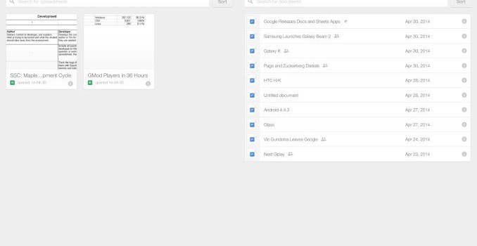
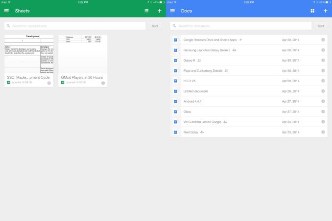
Immediately it can be seen that they greatly resemble the Google Drive app but each with their own color theme. Docs is blue, Sheets is green, and Slides will be yellow when it launches in the future. The apps have the ability to view documents in a grid with previews or as a list of names. Google has stated that the Google Drive app will eventually notify users to download these separate applications when they edit documents on their mobile devices. While users may be upset at Google’s decision to break what could be accomplished in a single app into separate apps, there will be benefits to this decision down the road.
For instance, when Google wants to add functionality that is specific to a certain document type they can add it to the application designed for editing those documents. The separate apps also recognize which documents in your Google Drive storage they are meant for editing which adds a layer of automated organization. Google is really just moving toward what every office suite does which is having separate applications for different tasks which share common functionality and design but have specific features tailored for the documents they work with.
After spending some time with the apps I’m happily surprised by their performance. There wasn’t a stutter to be found even when opening large spreadsheets. In the past I have felt that on iOS Google’s applications have had areas of middling performance but it is clear that those days are long past. In fact, had the apps launched two weeks ago before Apple’s iWork 2.2 update I would have stated that they were substantially smoother than Apple’s own apps on their own platform. The applications are equally as performant on any modern Android device. Even on an aging Galaxy Nexus running Android 4.3 they’re a joy to use.
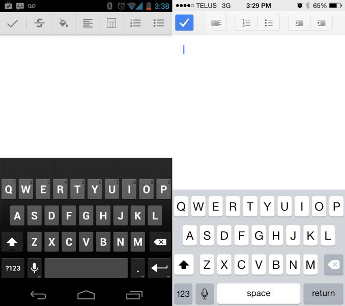
The iOS app is missing some features of the Android version
The biggest improvement I hope to see in both the applications is the ability to insert pictures into documents from the photos application. Improvements I hope to see in the iOS apps mainly relate to feature parity with their Android counterparts. Many of the text formatting options like strikethrough and font color are not available on iOS. The iOS app is also unable to create and edit charts like the Android app; you are only able to view them in the preview mode.
In addition to the new mobile apps, after returning home I noticed that the Google Drive for Desktop tool had placed icons on my desktop for Sheets, Docs, and Slides. Putting aside my feeling of discontent about icons being placed without asking, this shows that the push for separate branding of Google’s document editing tools is going to go beyond Google’s apps in the mobile space. It’s exciting to see a market that was once heavily dominated by a single office suite evolve with free and functional tools from companies like Google. Along with future updates to these new apps it will be interesting to see what this move means for Google’s other office suite, Quickoffice.


