Understanding Smartwatch Design
Although I mentioned this in passing in the Apple Watch review, I’ve increasingly realized that it is difficult for both manufacturers and consumers to really understand what makes a wearable well-designed. Manufacturers are still struggling to figure out what the real market is for smartwatches, and as a result what kind of designs they should be chasing. Meanwhile manufacturers have also done a so-so job communicating the purpose, use cases, and abilities of their devices with consumers, and as a result consumers are unsure what makes one product better or worse than the next.
After giving the matter some thought, I wanted to take a look at the subject of smartwatch design and by extension who manufacturers are designing for. Who is the real audience for smartwatches? Which features does that audience really need? How do those features mesh with consumer expectations? The market is broad – and that goes for both audiences and manufacturers – but there are several common threads across all smartwatches that can help everyone better understand who the primary audience is and what makes a good smartwatch for that audience.
Assumptions
To start things off, I think it’s worth talking about audiences, as there are two very different audiences that have to be addressed in the overall watch marketplace. The first audience is the audience that wears traditional watches. I don’t necessarily speak for this audience since I don't wear a traditional watch, but it’s clear that features like long battery life, always-on watchface, standardized bands, highly refined mechanical movements, and general craftsmanship are major points of focus.
However, at the same time the traditional watch market is inherently limited because even the cheapest cellphone has already integrated timekeeping capabilities; if all one needs is a device to keep time, phones can already do this and more. As a result, the second audience can be defined in opposition to the former, as the people who don't wear watches on a regular basis and have very different needs an expectations from the first group. There's also increasing evidence to suggest that there are significant demographic shifts, as younger people tend not to wear watches as often.
The problem with this sort of disruption by the cellphone in the traditional watch market is that in the end there will be a growing segment of the market that doesn’t necessarily see the value of a traditional watch. To me, a college student that has grown up with cellphones, a traditional watch is something that’s mostly unnecessary because I already have a way of checking the time, setting alarms/timers, and running a stopwatch. Combined with the discomfort of existing bands, I simply found it difficult to justify the need for a watch as there were issues with ergonomics on top of a general lack of utility. Although the discomfort aspect may be a personal problem, I suspect I’m hardly alone in the latter. As a result, as I see it the only real remaining “functional” purpose of a traditional watch is effectively a fashion accessory outside of niche use cases.
Implications
If we assume that people in general no longer wear traditional watches – and hence don't value the functionality provided by those devices – then the implications are significant for how the design of a smartwatch should be approached. The first, and perhaps most obvious change is that battery life is irrelevant when comparing to traditional watches. After all, current quartz-based watches last years between battery changes, but regardless of battery life someone that doesn’t wear a watch obviously won’t care how long a watch lasts. Battery life still matters in as much as hours versus days, but no amount of battery life a smartwatch could ever attain would be enough for someone who sets their standards based on traditional watches.
Similarly, things like always-on display are surprisingly not strictly necessary. Even if a traditional watch has an “always-on display”, it once again doesn’t matter because our design assumes that the average person has already decided that they don’t need a traditional watch, that they don't need to be able to see the time at every second of every day. Of course, responsiveness to make sure that the display is on instantly/just in time for the user to see the display matters, but it certainly doesn’t matter if other people can see what’s on the display. Things like mechanical movements also become irrelevant because the people that care about mechanical movements are people that have already bought a watch. Accurate time-keeping does matter, but a precise quartz-based clock is sufficient for this.
With that in mind, while there are a number of traditional watch features that are arguably unimportant to the audience for smartwatches, there clearly are other features that matter just as much to smartwatches as traditional watches. Probably the easiest way to turn users off is to have a smartwatch with an uncomfortable or otherwise irritating design. Even ergonomic problems that aren’t immediately obvious will compound over time. In some ways, this is like scratching skin as at first it might feel neutral or even soothing, but with enough time it will become painful and even harmful.
The other problem here is also industrial and material design. I’m probably not the right person to consult regarding the “right” design choices in this regard, but even I can recognize when a design is just not particularly tasteful. Given that a smartwatch is inevitably even more personal than a smartphone, poor design is basically unacceptable here. In some ways, lessons can be drawn from the watch industry and applied to this problem, but regardless of the approach taken it’s important for the watch to be broadly appealing in design.
Plastic watches in this context may have some appeal to the same people that like rubberized Casio G-Shock watches, but browsing for watches above 200 USD in price on Amazon shows that pretty much every watch is going to have leather and/or metal construction. Materials that aren’t authentic like pleather will inevitably affect the end user perception of value, even if polymers are enormously useful and often superior in some ways to metal or leather.
Moving on, now that we’ve covered what doesn’t matter to our assumed audience and what will make this hypothetical watch easily abandoned or returned, we can start to talk about what is going to sell the watch. This is easily the hardest part of all three aspects discussed here, which is only obvious if you start with the assumption that a significant portion of buyers have already decided that they don’t care for a traditional watch. If your product is effectively a traditional watch but with extra smart functionality, it may end up in the uncomfortable position of being too “digital” for those that want traditional mechanical watches, and not particularly interesting to those that aren’t interested in traditional watches because the extra functionality isn’t enough to justify the expense.
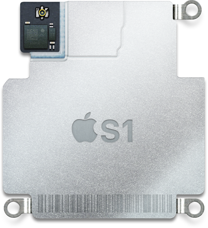
We can’t use traditional watches for a model of how smartwatches should function, but we can draw some inspiration from smartphones. This doesn’t mean that an OEM should try to cram a smartphone into a watch form factor and expect success, but the same sort of general model will help to create a solid foundation on which the rest of the user experience can rest upon. This means adding significant amounts of general purpose compute, which includes elements like a CPU, GPU, RAM, and NAND.
However, it’s dangerous to assume that this means using smartphone SoC with some BSP-level changes, as just the difference in TDP and battery size between a smartphone and a watch means that it’s important to recalibrate expectations for clock speeds. The severe constraints to PCB size also mean that there is an even greater need for integration on an SoC relative to smartphones, especially because unlike smartphones there are hard size constraints based upon wrist size. No one wants to wear a wall clock on their wrist, so this is especially critical.
We can also draw a lot of lessons learned from the smartphone industry for displays. As the display is going to be the main way the end user is going to receive information from the watch, it has to be extremely effective at this task. In order to do this, we need a display with high resolution, reasonably high frame rate, and an acceptably wide color range/grayscale.
From the smartphone space, we’ve discussed display resolution before, and there’s a sliding scale of acceptable resolutions. However, smartwatch displays will inevitably have a much larger minimum viewing distance because no one is going to hold a smartwatch close to the eye unlike a smartphone, which could be used for reading in bed or VR which effectively holds the display as close as possible to the eye. Smartwatches as a result need less resolution, but the average distance from the eye is going to be similar to smartphones, so 300-400 PPI will be needed to maximize spatial resolution to allow for maximum information density.
Frame rate is also important, as smartphones have shown that it’s important to have a UI that responds quickly to user input and other changes in the system. E-Ink is therefore effectively unacceptable here, as the end user is going to end up spending a lot of time waiting on the display to refresh in order to continue navigating a user interface, and animation is effectively impossible. 30 FPS might be acceptable here to try and reduce power consumption, but 60 FPS or higher is necessary for fluid UI and good user experience (cinematic or not).
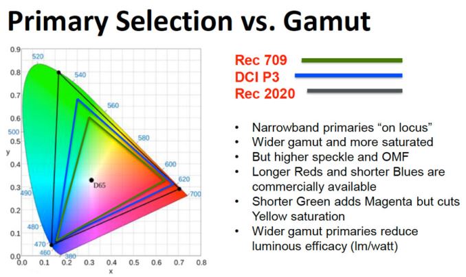
Color range is the last element, but especially critical. Although sRGB/Rec. 709 is the industry-standard gamut, this really just represents a starting point and as technology advances wider gamuts will be necessary to accurately reproduce user content as gamuts like Rec. 2020 and others become industry standards. Grayscale isn’t really color, but the two problems are generally related from a calibration standpoint. Accurate grayscale reproduction falls under calibration, but the other aspects that affect grayscale include peak contrast of the display and reflectivity of the display.
The former is a generally well-understood problem and true infinite contrast can be achieved by using an OLED display, but the latter has generally been overlooked even in the smartphone space as testing reflectance is often well beyond the scope of most websites and subjective observation of reflectance is strongly affected by changes in ambient light conditions. Although single crystal sapphire can avoid scratches to the display, without anti-reflection coatings the reflectance of the material is significantly higher than traditional aluminosilicate glass. Regardless, it’s clear here that experience in the mobile industry will help significantly with getting display right in wearables.
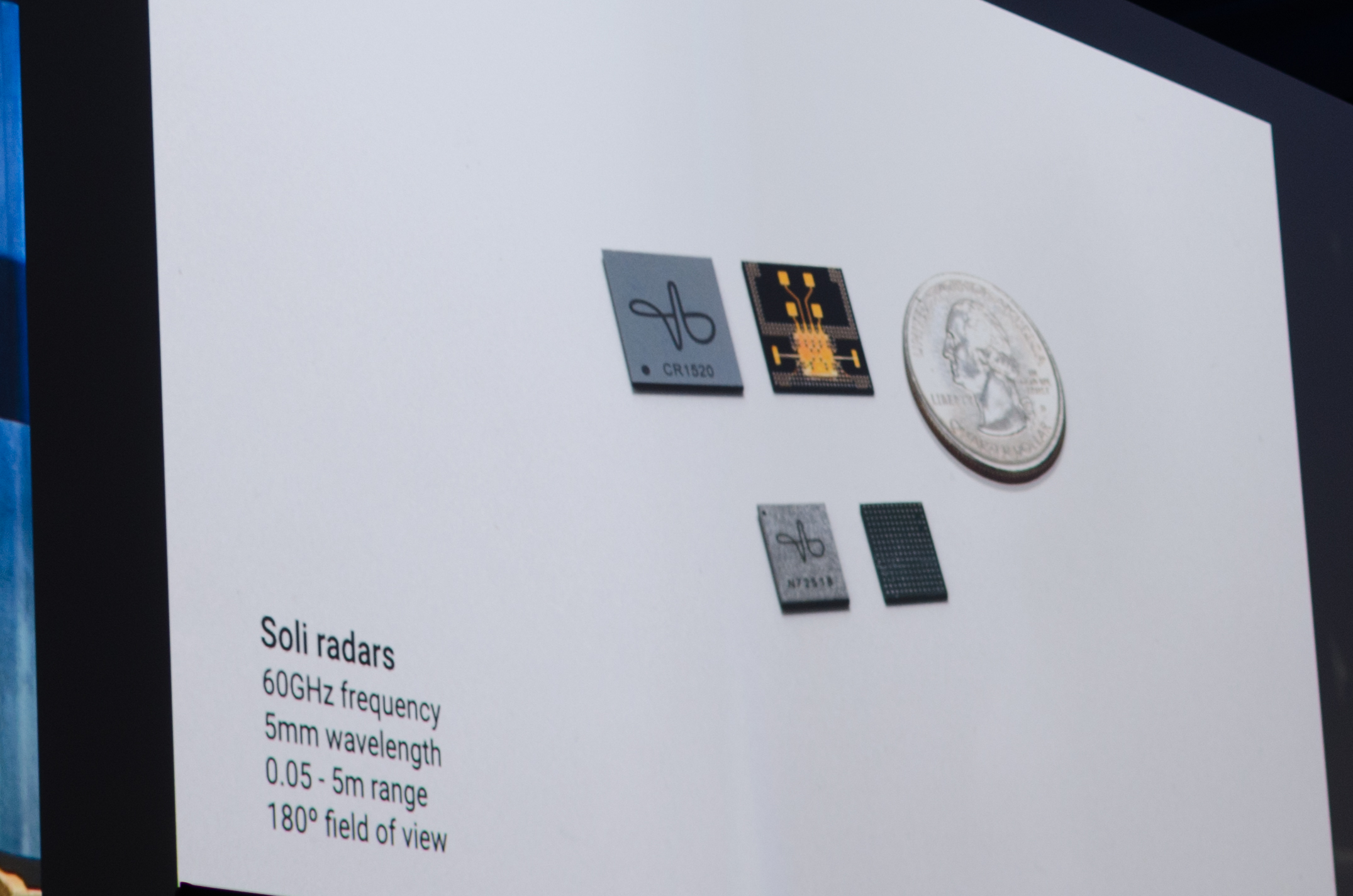
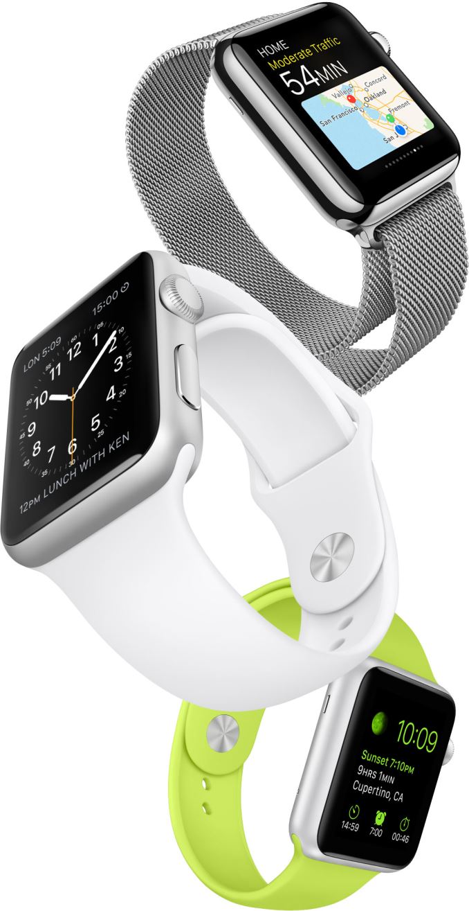
If the display is output, then the other side of the problem that needs to be tackled is input. In this regard, the challenges are even more significant than they were with smartphones. Unlike a smartphone, a touchscreen keyboard is absurd and unacceptable for user experience. Touchscreens can definitely be helpful, but the precision of a touchscreen on such a small display means that large touch targets are necessary. Trying to solve this problem is difficult, but we’ve definitely seen viable solutions already in the form of the digital crown and Force Touch on the Apple Watch and Google ATAP’s Project Soli. I’m not sure how many other ways there are to implement similarly precise input solutions, but this is one case where experience in smartphones is insufficient to deal with the new challenges presented in wearables.
Outside of these hardware challenges, probably the most important aspect of the user experience will be software. Existing smartphone OSes can definitely serve as a useful base, but the entire UX has to be redesigned to deal with realities of smartwatches and also to enable use cases that will actually make the watch worth buying. This isn’t nearly as easy as it sounds, because pretty much every wearable OS I’ve tried so far has been rather disappointing here. WatchOS arguably stands alone here right now as the only wearable OS that complete enough to provide a user experience that justifies a smartwatch, but as I noted in the review even watchOS has a long way to go before it’s worth recommending to a mass-market audience.
A smartwatch OS has to have a sort of hierarchy of information, in which there has to be information that is immediately given to the user on first glance such as the time, notifications, and other quick information. Equally quick actions should be possible. However, it’s also important to have actions that might not necessarily be quick but allow for useful interaction without the need for a significant context switch that happens from using a smartphone. Key use cases here include opening a messaging application to read and send messages, reading/managing email, viewing/creating calendar events, turn by turn GPS navigation using the wrist, short checks of social media/news like Blinkfeed, and various metrics from sensor tracking such as fitness. There is no step by step guide here for how to design a UI here, but we can draw lessons from smartphone UI design. However, it’s important to keep in mind though that blind translation of smartphone UI to smartwatch UI is an excellent way to have poor information density and frustrating user experiences.
A lot of these previously discussed use cases are definitely already present on smartphones, which may be confusing to those that haven’t used smartwatches before but it’s really important to emphasize that the smartwatch avoids the loss of context that comes from using a smartphone. This is because using a smartwatch means the display is usually kept a good distance away, and even if it is the center of focus it’s still relatively easy to keep track of one’s surroundings. With a smartphone, the display is usually sufficiently large that it’s easy to only focus on the display content, as evidenced by anyone that uses their smartphone while walking.
However, these advantages are only obvious to those that already have experience with smartwatches. It’s also important to appeal to people that haven’t had any experience with smartwatches. This means implementing functionality that is otherwise impractical on a smartphone. The first, and perhaps most obvious way of doing this is health tracking, which can be done by using pulse oximeters, accelerometer/gyroscope sensor fusion to track distance/exercise/standing, and various other sensors. Sleep tracking is also reasonably viable with a smartwatch, but this imposes some pretty significant battery life requirements if charge time isn’t less than about half an hour to an hour.
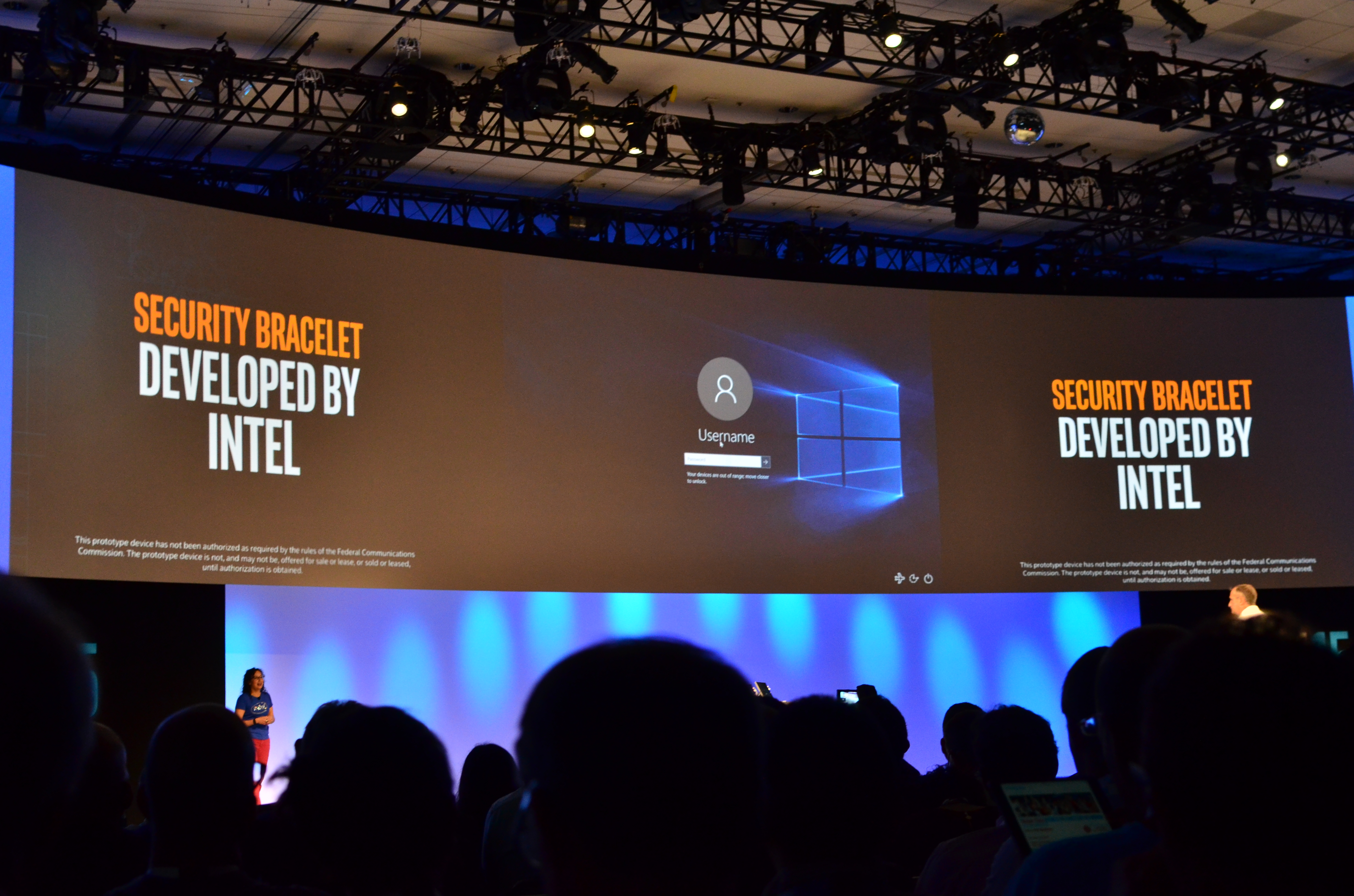
In general, the applications here beyond fitness are difficult to think of because they need to effectively exploit the placement a wrist-mounted general compute platform for applications that would otherwise be impossible to accomplish on a smartphone. Applications like using a smartwatch to unlock locks would definitely fall into this category, but requires significant infrastructure in addition to buying the watch, which represents a barrier to adoption. Intel’s proof of concept for a security wristband could definitely be extended in a number of applications that would make sense in a smartwatch.
Final Words
In the end, smartwatch design isn’t something that can be fully explained in a single short article. Despite this, it’s clear to me that a number of companies are simply making smartwatches as a possible growth market without really understanding the value of smartwatches, and people in general don’t seem to understand the value of smartwatches either. This is hardly unsurprising though, as this segment of the market has yet to hit a point of widespread adoption.
As a result of the immature state of the market, the industry as a whole can't rely on consumer feedback either. People who haven't worn watches in years won't know what they want from a smartwatch until they see what they want. Even people who continue to wear traditional watches won’t be the ideal source for information on what a smartwatch should do and what it should look like because a smartwatch cannot just be a better watch. Experiences from the watch and smartphone industry can be applied to solve some engineering challenges in the smartwatch form factor, but in other cases completely novel solutions must be created, especially in regards to user interface.
Of course, one lingering doubt remains here, as just about every argument here is built upon the assumption that most people no longer wear watches every day. However, even if this assumption is wrong, it's still important to consider when viewing how smartwatches are designed. After all, the new features and capabilities a wearable brings to the market should be able to stand alone. If the "smart" functionality isn't enough to stand on its own, all we're left with is a watch. If all we're left with is a watch, is it really worth calling a smartwatch?

